The landing page is today’s version of old-school advertising flyers.
In the pre-internet days — even the pre-television days — how did people advertise their goods and services? With an advertisement page in the newspaper, or a magazine, or even stapled to a telephone pole.
And what did those one-pager advertisements need to be successful? An eye-catching layout, concise and snappy copywriting, and a sense of flow that directs the reader towards what you want them to buy.
Those same advertising lessons of yore can be applied to modern landing pages — and that’s exactly what we’ll be doing today, as we explore landing page best practices, ideas, and examples.
Before we get into the meat of the article though, let’s clear up a few common questions:
What Is A Landing Page?
A landing page is a standalone webpage that’s designed specifically for marketing and advertising. It’s named for being the place that a potential customer “lands” after they click on your cleverly-worded call to action in an email, tweet, PPC campaign, Google ad, Facebook ad, etc.
In short, landing pages are designed with a single goal in mind: Converting your potential customer to a real buyer.
Should I Have A Landing Page?
Are you selling a specific good or service, and using an advertising or marketing campaign to do it? If you answered yes to both questions, then a landing page will be an essential part of your marketing toolbox.
Realistically, you’ll have multiple landing pages to test out different angles on your advertising pitch; more on that at the end of the next section.
However you build them though, using landing pages allow for additional marketing benefits. For example, they make it easier to improve your quality score on both Google ad and Facebook ad campaigns.
You can serve a specific a specific trust signal or customer testimonial rather than letting them get buried on your site. You can also write your landing page copy so that it gets search engine traffic via inbound marketing / SEO. You can also test out the functionality of new a lead capture form or CTA button before rolling it out to the rest of your website.
Landing Page Best Practices
So what makes a landing page tick? It’s the same principles that have made advertisements successful since their introduction to newspapers in the 16th century.
Let’s take a closer look at each of these principles one by one, before tying them all back together into one cohesive message.
Stay Consistent With Your Brand
First and foremost: What is the focus of your brand? What is your value proposition for your target audience? Even though a landing page has a very different purpose from your homepage, the way you deliver your brand’s message should be consistent.
In simple terms, this means making the language and visuals used in your landing page congruent with the link that got your visitor there. This is easier to visualize in its opposite form, which you never want to do:
Imagine getting an email from a company whose newsletter you’re subscribed to. In the email, they make a clear and concise statement about a new product they’re offering: A superfood supplement that’s specially formulated to help with your post-workout recovery.
So you click on the link at the end of the email. But then, the page that loads is filled with pictures of half-naked fitness models, with giant hyperbolic claims as to what the supplement will do for you — everything from improving your sex life to curing your chronic illnesses.
Would you trust this page, or this company any longer? Heck no. Because you’d feel like you were misled. That feeling is exactly what you’re trying to avoid by staying consistent with your brand.
Remove Any Distractions
On an effective landing page, you can’t afford to have anything that distracts from your one, central message. Cute graphics and personal anecdotes have a place somewhere on your main website, but leave them out of your landing page.
What constitutes a distraction? Anything that doesn’t support your landing page’s conversion goal.
Ideally, your landing page will be a laser-focused combination of stellar copywriting and precisely selected visual elements, which we’ll cover in the next two sections.
Point Your Reader in the Right Direction
When a reader finds their way to your landing page, the first impression they’ll get is a strictly visual one. Yes, before they ever read the first letters of your brilliant copywriting, every visitor will be naturally drawn to the shapes, colors, and general flow of your page.
This means a few things for how you should employ visuals in your landing page:
- Make your message clear, bold, and at the top and center of the page.
- Avoid large blocks of text (AKA keep it skimmable)
- Keep your main point “above the fold” (don’t make your reader scroll to get to it)
- Have your first Call to Action (CTA) bold and apparent as soon as the page loads
- Add arrows, shapes images, or short videos at the bottom of the page to keep your visitor scrolling and reading
Do all of those things without cramming too many into your landing page, and you’ll have a visually enticing advertisement that clearly points your reader where you want them to go.
Make Your Copy Clear and Focused
Copywriting is a remarkably different world from the sort of conversational writing you might use in an email. And it’s main tenant is this:
Write as little as possible to get your message across.
This is much, much more difficult than it sounds! Mark Twain is even famously quoted as apologizing for the length of a letter he wrote, because he “didn’t have time to write a shorter one”.
Good copy on a landing page will use the bare minimum number of words, carefully selected to create maximum impact. If you’re not comfortable with writing your own copy, there are plenty of talented copywriters to contract through freelance outlets or agencies.
The litmus test for clear copy? Ask someone outside of your industry to read your landing page, and then ask them what you’re offering. If they can’t answer correctly right away, then the copy probably needs to be refined or reorganized.
Include Social Proof
And most importantly, include authentic social proof. Most internet users are savvy enough to be able to tell when a company is making up testimonials — and that will cause people to click away from your landing page, never to trust your company again.
If you have testimonials or reviews for your product or service, include them with as much personal detail as you can. This includes full names, photos, and job descriptions for anyone that thinks your product is the bee’s knees.
The gold standard for social proof might be a short video of your product or service in action. If a picture’s worth a thousand words, then a video must convey at least a million, right? If you can get an honest reaction from a customer about your product or service, and set that to soft music, it’s almost guaranteed that you’ll convince (and convert) prospective customers.
Make It Accessible to All of Your Readers
With each passing year, mobile browsing continues to make up a bigger share of the total visits to webpages. Just last year, in fact, mobile devices (smart phones and tablets) comprised 61% of all visits to U.S. websites — up from 57% the year before.
What does this mean for your landing page? It has to be mobile friendly if you want it to succeed.
If you’ve followed the guidelines we’ve laid out so far, most of the work here is already done for you. Removing distractions and focusing on your brand’s core attributes will help your page load faster, and you really want your landing page to load fast. If a mobile visitor clicks on your page and has to wait more than about 2 seconds for it to load, chances are they’ll click away and you’ll lose your chance at a sale.
Accessibility isn’t just about making your landing page mobile friendly, though. It also means using clear, concise copy that’s easily understood. The common advice is to stick to a 6th grade reading level for your web copy, ensuring that everyone who lands on the page has an easy time reading and comprehending your message.
Lastly, if you have a contact form on your landing page, keep it as simple as possible. Too many fields to fill out will alienate a potential customer faster than you can say “home address”.
Test, Test, Test
Publishing your landing page and directing traffic to it is only the beginning. After all, how are you going to know whether your pitch is really getting the most engagement, and pointing people towards buying your product or service?
To know that, you’ll need to do a fair amount of A/B Testing. I’ll let Amy Gallo of the Harvard Business Review give you the best explanation of what that is and how it works:
A/B testing, at its most basic, is a way to compare two versions of something to figure out which performs better… You start an A/B test by deciding what it is you want to test… Then you need to know how you want to evaluate its performance.
And the simplest way to do this for your landing page is to make two similar versions of it, randomize which page loads when your visitor clicks your link, and then track your data.
For example: Imagine two versions of your landing page. One has a big, red “Buy Now” button at the bottom. The other has a small, blue “Buy Now” button in the same place.
By randomizing which page visitors see, you can collect data on which button gets pressed more often — and then use that as your standard landing page.
This works for any variable on your landing page, from the layout to the copy to the images and more. I strongly suggest changing only one element at a time, so you can get a better sense of which changes have the greatest impact on your conversions.
Getting the Most Out Of Your Landing Page
If you take the time to combine all the advice in this article, and then continue to A/B test your best landing page ideas, success is virtually guaranteed. And a well-tuned landing page is a powerful tool for sales and advertising, potentially drawing in huge revenues for business of any size.
As parting advice, I’d like to leave you with this: Always be revising your landing page. In advertising and marketing, times and trends change quickly. By getting in the habit of making small adjustments, your messaging will always be fresh and relevant. And the greater the impact on your audience, the better chance they will invest in your product or service.
Inspiration and Examples
To wrap things up, let’s take a quick look at some of the best landing pages on the web today:
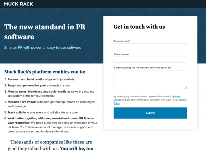
Muck Rack, a platform for journalists and public relations professionals, has their home page double as their landing page – but they also have dedicated PPC landing page variations. But across the board they rely on one thing:: Social proof, an attractive layout, and an easily accessible call to action.
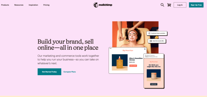
Mailchimp is another one that makes great use of the dual home page/landing page structure. They get right into the meat of what they do with clear, concise copy about education and educators. It’s excellent on mobile, too.
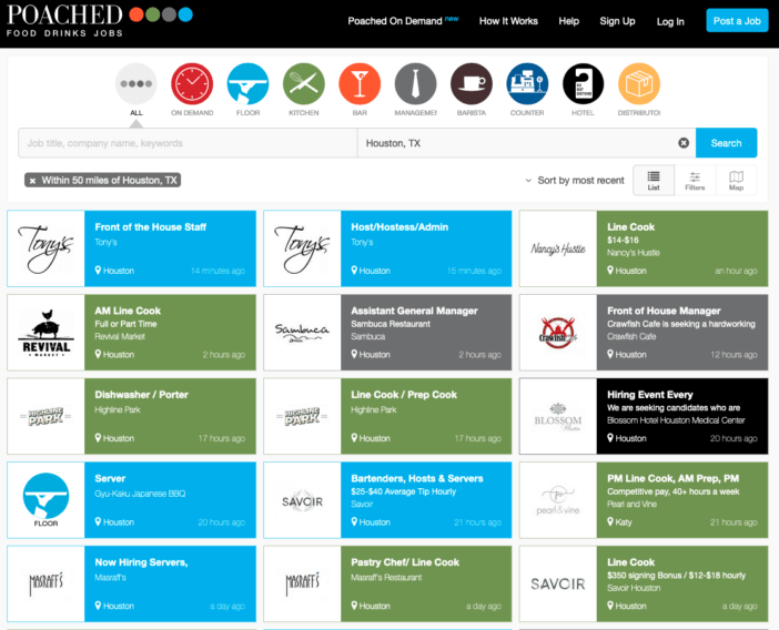
Poached, an industry-specific job board for food service workers, automatically loads a location-specific page when you click through. They make it easy to connect restaurant professionals with the businesses that want to hire them, and it’s as easy to post a job as it is to apply for one.
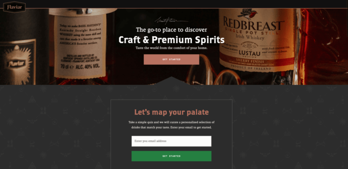
Flaviar, a top shelf spirits subscription service, combines compelling imagery with a clear and upfront call to action.
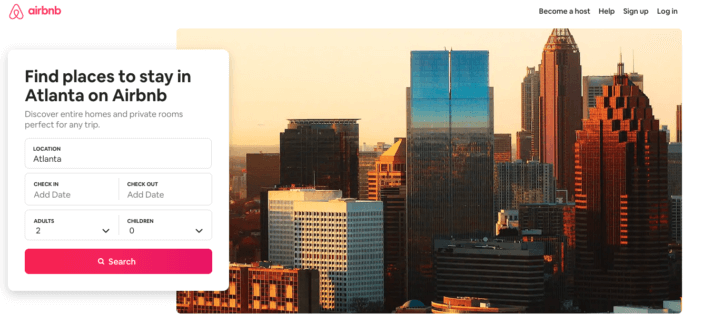
Airbnb is a fantastic example of a landing page that continues to innovate and refine its message. Check back frequently to see what changes — and more importantly, what doesn’t. The things that stick around are what’s really working for this landing page.
Thanks for stopping by today, and please do reach out with any marketing, advertising, and website building questions you might have!
Related Articles
- How to Build a Minimally Viable Website
- 404 Page Best Practices, Ideas, & Examples
- Contact Us Page Best Practices, Ideas & Examples
- Ecommerce Product Page Best Practices, Ideas, & Examples
- Effective About Us Page Design: Best Practices & Examples
- FAQ Page Best Practices, Ideas & Examples
- Homepage Best Practices, Ideas, & Examples
- How To Design a Website Layout w/ Best Practices & Examples
- Thank You Page Best Practices, Ideas & Examples
- What Is A Web Design Color Palette and How Do I Make One?
- How Much Is A Website Per Year Explained
- 59+ Ways To Find Free Images For Commercial Use
- How to Improve Your Website Content
- How To Write A Meta Description For SEO
- How To Write A Title Tag For SEO
- Website Design Best Practices w/ Ideas & Examples