Larry's Take
| Platform | Cloud |
|---|---|
| Price | FREE - $299 per month |
| Annual Discount | No |
| Promotion | Sign Up Free |
What Is MailChimp?
MailChimp has been one of the fastest-growing email marketing providers for years. They’ve built a massive base of customers ranging from small personal accounts to some of the most prestigious enterprise brands in the world.
MailChimp would argue that they are a marketing platform, but in my opinion, email marketing is really at the core, and it’s what they do best.
MailChimp has some natural strengths, but there are also some disadvantages to the platform, and they aren’t the best fit for everyone.
In this MailChimp review, I’ll explain how MailChimp has helped my clients (the pros) and ways that MailChimp still needs to improve (the cons).
Ready? Let’s dive in.
MailChimp Pricing
MailChimp’s paid plans have always been competitively priced, but their service is free if you have 500 or fewer subscribers.
Unlike other providers, they don’t have a free trial. Instead, they have a free account. If you are a small business, it’s no risk and no payment.
If you are an enterprise brand, it’s easy enough to set up a free account with an email segment and run a longer-than-14-day test to see which provider fits your needs best.
Above the free plan, MailChimp’s pricing is fairly straightforward. You pay a subscription fee for features, then a tiered level based on subscribers.
For advanced email marketers, MailChimp has a $199/mo service to help with automation, multivariate testing, etc.
MailChimp’s pricing is competitive whether you are at the free level, business, or enterprise level.
Pros of MailChimp
Focus on Email Deliverability
As an email recipient, I’ve never seen a MailChimp-powered email land in my personal spam folder.
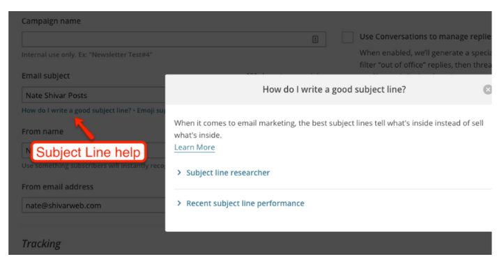
The company dedicates considerable resources to fighting spam. They have some of the most restrictive sending policies. When crafting an email, they give you repeated tips to improve email deliverability (i.e., examples of non-spammy subject lines, examples of adding clean, opted-in addresses to your lists, etc.).
All this effort seems to pay off. Their slogan is “Send Better Email.” I like this – not just as an email marketer, but as a citizen of the internet hoping for less spam.
Dashboard & Learning Curve
MailChimp claims to launch a new version of its software every four weeks. They have a lean support team (for better & worse) and are committed to increasing the usability of their software, and for the most part, I think they succeed.
Few email software providers will let you go from signup to send in minutes, but MailChimp’s Dashboard is simple, clean, and filled with helpful tips and a straightforward workflow.
While MailChimp has plenty of enterprise-level features, they only appear on the screen where you need them. Their Dashboard & design focuses on creating & sending an email rather than tweaking dozens of settings all in one place.
Template & Designs
Email design can be complicated. When you think about all the variables, from the various devices people read email on to when people open and read emails, getting the design right from the recipient’s perspective is tough.
When you add in branding, messaging, content, etc., email design is tough. But MailChimp’s email design environment is a strong suit.
They are the only provider I’ve seen with a true drag-and-drop design builder. They have a built-in live previewer. This combination means that anyone can implement a complex email design without getting into the nuts and bolts of HTML.
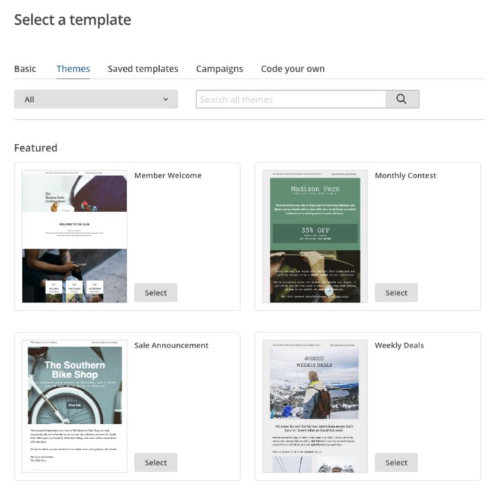
Additionally, they have a massive range of email templates to get your design started with.
Their designer has a library or ‘merge tags‘ that automatically pull information from your account database (i.e., your website info, the recipient’s name, regulatory info, social info, etc.).
And the designer will automatically convert designs into plain text mode for increased deliverability.
Lastly, MailChimp is constantly upgrading the design experience. Unlike some competitors, like Aweber, their design interface looks much different than it did nine years ago.
It’s 2023-contemporary with classic and trendy design elements, including modern-looking hero images.
Company Culture
I used to be a company culture skeptic. As a customer, I thought that a company talking about its culture was nothing more than an attempt to recruit new employees or whitewash a mediocre product.
While both can be true, culture can also indicate how & where a company invests its money. As someone looking to choose a vendor for years to come, how & where a company is allocating its resources can indicate what kind of product you will have in a few years.
MailChimp is famous in Atlanta’s tech culture for its creativity, branding, design, generous benefits, and community sponsorships.
Usually, you’d think that an email service provider would be the most boring, staid company in the neighborhood. MailChimp certainly is not.
If you have 15 minutes – I highly recommend this talk their CEO gave a few years ago.
Integrations
The magic of email marketing happens when multiple apps work together. For example, many website owners will use OptinMonster for email collection and another for publishing.
They’ll use yet another for planning marketing automation, retargeting, or social media management. And the list goes on.
At the center of all these apps is your email marketing software. It’s almost expected that your email marketing provider will integrate with every app.
MailChimp is one of the most developer and integration-friendly email platforms. When using MailChimp, you have access to more apps for other tasks since MailChimp more than likely has an integration.
Native Apps
But not only does MailChimp integrate with several other apps, but they also have an entire suite of native apps for different types of customers, including MailChimp Mobile, MailChimp Snap, and MailChimp Subscribe.
Whether you are sending, managing, or collecting emails in person – MailChimp’s mobile apps work and work well. Even if you don’t do big events, having mobile as an option makes a huge difference when you need it.
Cons of MailChimp
Like any product or service – MailChimp isn’t for everyone. While they do a better job than most, there are things that MailChimp does not do well that you should consider.
MailChimp-ese
MailChimp’s brand is engrained throughout its platform. For better and for worse, MailChimp has a unique language for its features & processes.
If MailChimp is your first email provider, you won’t notice. You’ll likely find it fun and simple.
But if you are coming from other email providers, you’ll likely find it confusing. The learning curve will be a bit steeper.
For example, most email providers use lists and segments. MailChimp has lists, groups, and segments. In many ways, I like MailChimp’s setup. But it’s not industry standard.
MailChimp no longer does “autoresponders” – instead, they do “automation flows.”
You can find an entire glossary of MailChimp terminology in the MailChimp Help Center.
It’s great from a marketing and branding perspective, but it can be tiresome to figure out what MailChimp is referring to if you’re used to standard industry terminology.
Buried Defaults & Data
From a beginner’s perspective, MailChimp’s default setup is awesome. They pull from the best practices they’ve documented from their enormous body of data.
Everything from their forms to list formatting, key metrics, tracking, and designs has default settings. They also automatically consolidate metrics into more accessible & simplified ratings.
But to dig up and change the specific defaults or specific pieces of data can be frustrating. It’s all buried on second screens or specific workflows.
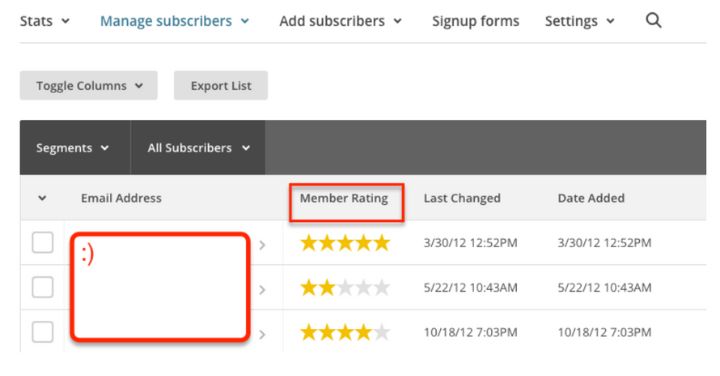
For example, “member ratings” consolidates the deliver, open, and click rates for each subscriber across all your campaigns. But it requires some digging if you want to find an open rate for a subscriber in a single past campaign.
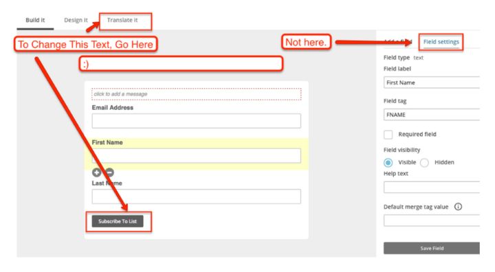
The same goes for changing the text on default signup forms. You can’t edit it quickly. You have to go into the build a form workflow and go to Translation Settings, then re-save the form.
Most of this stems from the fact that they bias their processes towards making the initial setup super-easy. But that creates a situation where it’s more difficult to go back later to make a quick change.
It’s not a huge consideration, but it’s something that I wish I could edit after using MailChimp in the same way for years and years.
Very Frequent Updates
MailChimp is constantly improving its product. They are famous in the web development community for rebuilding their product every few weeks. That makes for a very slick and cutting-edge product.
It’s also a bit maddening for a non-frequent user.
As soon as I figure out all the shortcuts, MailChimp re-configures everything.
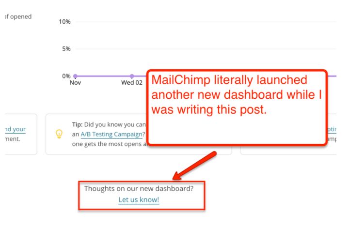
While I was writing the first draft of this post, MailChimp rolled out an entirely new Dashboard – and they are constantly making small tweaks to various screens. I regularly refresh this post, but I know that at least one screenshot will be wrong.
I’d rather have MailChimp’s system of regular UX updates than a setup that looks like it’s circa 2002, I just wish MailChimp would slow down a little bit on design changes.
Fiddly Native Forms
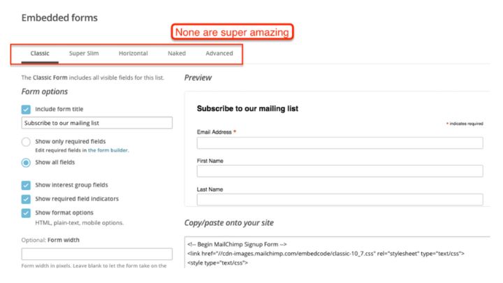
MailChimp provides several native forms that you can copy and embed on your website or social media channel.
They are fine. But they are also very fiddly. You still need to know CSS to get them *exactly* right. There’s no drag-and-drop or drag-to-adjust functionality.
And the default looks like a default form. I see them everywhere online – the evidence that a website is using MailChimp.
If you have an HTTPS website, you must test and make changes to make the form work (even though MailChimp implies that they support HTTPS by default.)
(Emergency) Customer Support
I think MailChimp has attempted to eliminate the need for customer service. Their product simply works. It’s intuitive. And they have a thorough knowledge base.
Their customer support team is also great.
But they only work business hours in the Eastern time zone. If you run a campaign on the weekend or at night – there’s no customer support.
In some ways, I admire their choices. It’s worked for them for years, and it’s good to see a company excel outside an obsessive 24/7 operating schedule. But if your company needs 24/7 on-call customer service, you’ll want to factor that into your decision.
MailChimp Alternatives

- Rating
- 8.0/10
- Price
- FREE - $149 per month
- Promotion
- Get AWeber Free
FAQs
Final Thoughts on MailChimp
As an email marketing service, MailChimp has plenty to offer. Their simple and intuitive dashboard makes it easy for new users to manage their email lists and create and send email campaigns.
You can design beautiful landing pages using MailChimp templates, and their drag-and-drop builder is one of the best in the industry. These benefits, along with their Free plan for up to 500 subscribers, make MailChimp an excellent choice for new email marketers and small websites.
That said, if you have a larger audience or need to use more automation in your email marketing campaigns, MailChimp comes up short compared to my top choice, ActiveCampaign.
ActiveCampaign is designed to grow with you as your needs change. It can handle everything from small websites to large enterprises with hundreds of thousands of email subscribers. They offer more value at the high end, and their ability to automate email campaigns is unparalleled.
The bottom line is that if you’re starting, and usability and cost are factors, MailChimp is forever free for audiences up to 500 subscribers – you can sign up here and try MailChimp yourself.
If, on the other hand, you have ambitious growth plans or want more automation options, I recommend ActiveCampaign.

