So you’re creating a dental website, and you’re looking for dental website design examples for inspiration and guidance. You’re also wondering which website platform is best to use for your website.
But before we dive into examples of what dental websites look like in the wild on a variety of website builders and hosting platforms, there is one thing to keep in mind when you’re evaluating a website: it’s not just about how the websites look. The functionality matters too.
Think of it like buying a car. You have a make / model in mind, and you’re probably looking to see them drive by on the road to see how they actually look. However, you also care about how they operate. Does it accelerate well? Does it have the hauling capabilities you need? How is the gas mileage?
Looking at a dental website examples should be done in the same way.
Do you want the website to have appointment scheduling functionality? Do you want a patient portal? This functionality needs to be consider before you start choosing a website builder + hosting platform.
Find The Right Website Builder for Your Dental Website
We collected the following website examples not just to show you how they look on different platforms, but how they can function, so you can be sure you create a website that fits both the look and functionality you need!
Best Dental Website Examples
We’ve pulled these examples based on functionality, design, and usability. Again, when you’re looking to build a dental website, remember that you’re not just thinking about making the site look good. You want to think about what your site actually needs to do, and find a platform that supports all of your needs.
Ponce Dental Group
Software: Adobe
Hosting: Adobe
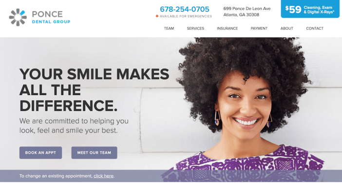
This dental website by Ponce Dental Group has all of the bells and whistles. You can book an appointment, manage your appointments, and learn about payment plans and insurance all from the homepage. And yet even with all of this information, the layout is still clean and information is easy to find.
If you’re looking for a website layout that allows you to have multiple calls to action without overwhelming visitors or making the site difficult to navigate, this dental website example is a great one to use for inspiration.
Bay Area Dental Surgery
Software: Weebly (Weebly Review)
Hosting: Weebly (Weebly Review)
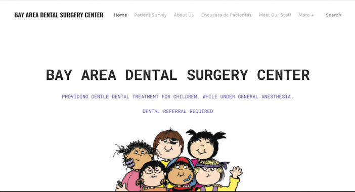
On the other side of the spectrum is this dental website by Bay Area Dental Surgery Center. We liked the simplicity of this website, with the clear header and subhead that tells you exactly what this dentist does and who they help, and the cartoon graphic that adds an element of creativity and branding to the site.
This example just goes to show that a simple, straightforward layout can still be incredibly effective for your dental website. You don’t necessarily need something with tons of advanced functionality or even advanced branding!
If you’re looking for a good dental website example that includes a simple template that you can just plug your content into and get going, this is a great one to reference.
Grace & Leedy
Software: Squarespace (Squarespace Review)
Hosting: Squarespace (Squarespace Review)
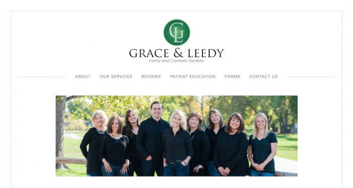
This dental website example stands out for a few key reasons. First, notice how clear the navigation is on the homepage. As soon as you land on the website, your focus is drawn to the options of where to go next. It’s straightforward and makes choosing a next step simple.
We also liked the download functionality on the Form page.
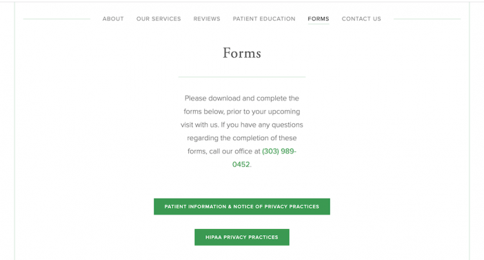
The clear instructions and bright call-to-action buttons make it easy for visitors to see exactly what they need to do, and including the forms on the website not only enhances new patients’ experience online… but in person, too! No more filling out endless forms in the waiting room!
This site is another great example of a simple template that makes the most out of the design and functionality to give visitors a great user experience.
Dr. James Catt DMD
Software: Self-Hosted WordPress
Hosting: Codero + Linode
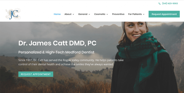
This dentist website example stood out to us for a few key reasons — the first of which being the color palette! Notice how the buttons, logo, and even header image all have the same color scheme. It makes the design look sophisticated, even though the layout is fairly straightforward.
Next, we also liked how Dr. James used focus landing pages to expand on each of his services:
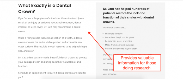
This is a great way to make more detailed services pages that also provide valuable information for potential clients who may be doing research on dental procedures before deciding to move forward with them.
St. Lawrence Dental
Software: Wix (Wix Review)
Hosting: Wix (Wix Review)
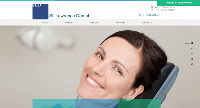
Have you ever gone to a website to try to find logistical information (like operating hours and contact information) and had to dig for it? How frustrating is that?
This dental website does a great job of keeping key logistical information in clear view. Notice how the operating hours, telephone number, and “request an appointment” button are all grouped together in the top right corner of the homepage. This gives visitors all of the information they need when booking an appointment, without them having to dig around the site to see when the clinic is open, how to call, or where to request an appointment.
Atlanta Dental Spa
Software: Self-Hosted WordPress
Hosting: Google Cloud / Google
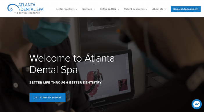
This website for Atlanta Dental Spa is another strong dental website example that hits all of the marks. The layout is clean and sophisticated, and although the site has a lot of content (including before / afters), it’s organized in a way that’s easy to navigate.
We particularly liked the Messenger functionality Atlanta Dental Spa includes, which allows you to chat with them on Facebook Messenger directly from their website.
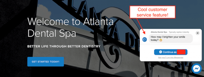
If you’re looking for an overall example to use for inspiration for your dental website, check this one out!
Next Steps
Now that you have some inspiration in terms of the design, colors, and functionality you may want in your dental website, where do you go from here?
Well, it really depends on where you are in your dental website building journey!
If you’re ready to decide on a website builder, check out my guide to choosing a website builder here.
Lastly, if you’re wondering how to market your dental website, check out my guide to creating a local marketing strategy.


