So you’re creating an event website, and you’re looking for event website design examples for inspiration and guidance. You’re also wondering which website platform is best to use for your event website.
But before we dive into examples of what event websites look like in the wild on a variety of website builders and hosting platforms, there is one thing to keep in mind when you’re evaluating a website: it’s not just about how the websites look. The functionality matters too.
Think of it like buying a car. You have a make / model in mind, and you’re probably looking to see them drive by on the road to see how they actually look. However, you also care about how they operate. Does it accelerate well? Does it have the hauling capabilities you need? How is the gas mileage?
Looking at a event website examples should be done in the same way. We collected the following event website examples not just to show you how they look on different platforms, but how they can function, so you can be sure you create a website that fits both the look and functionality you need!
Best Event Website Examples
We’ve pulled these examples based on functionality, design, and usability. Again, when you’re looking to build an event website, remember that you’re not just thinking about making the site look good. You want to think about what your site actually needs to do, and find a platform that supports all of your needs.
Bonnaroo Music & Art Festival
Software: Self-Hosted WordPress
Hosting: Amazon (Cloud)
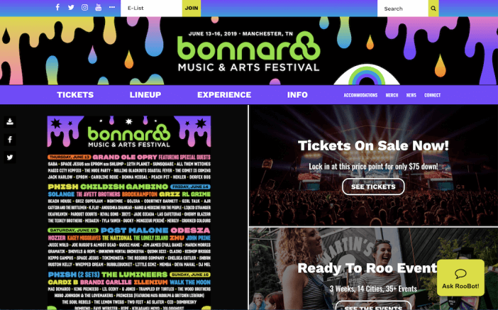
What stands out about Bonnaroo’s site is how much the design captures the essence and atmosphere of the festival. It’s creative, loud, and a bit in your face (in a fun and playful way). In terms of functionality, this event website also has all of their bases covered. You can buy tickets, see event details, explore the lineup, and even ask their help bot a question.
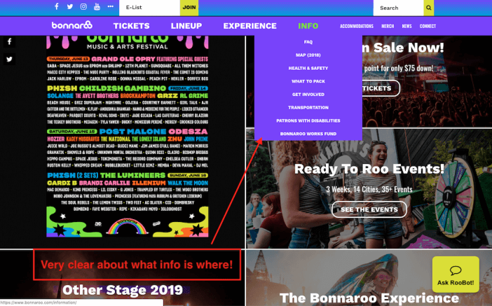
We especially liked how easy the website is to use. Even though there’s a lot of content packed into the site, the navigation is straightforward, and we didn’t have to spend time digging to find what we needed.
Sandy Springs Artsapalooza
Software: Self-Hosted WordPress
Hosting: GoDaddy
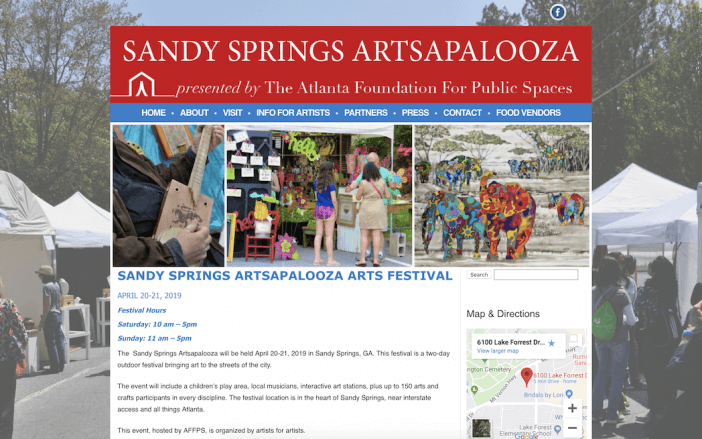
On the other side of the spectrum is this local events website for an Atlanta art festival. What we liked about this site is the simplicity. The design is straightforward, but it still includes all of the information you need about the festival (including built-in map functionality!).
It just goes to show that your event website doesn’t have to be some masterful designed site… it can be simple and straightforward and still get the job done.
Atlanta Sport and Social Club
Software: League Lab
Hosting: Amazon Web Services
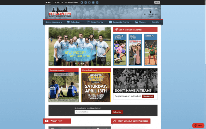
Atlanta Sport and Social club is a really interesting example of an event website that uses a niche software provider (League Lab) to get very specific functionality. Take a look at their Schedule and Standings page.
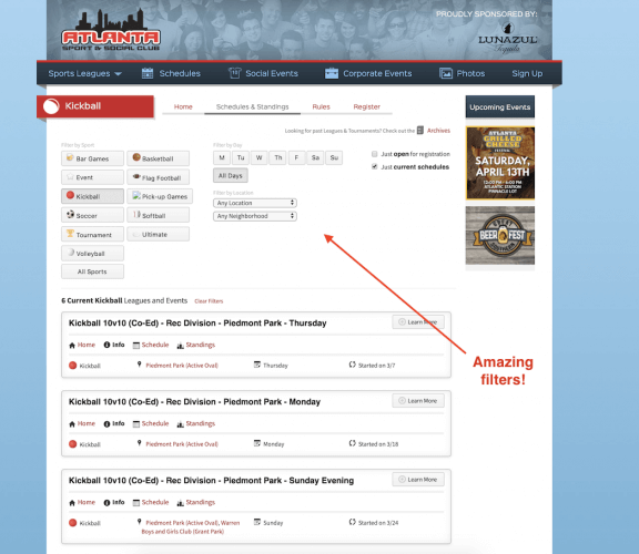
You can filter by spot, date, location, and even neighborhood! They also integrate social events, corporate events, and photos. This is a great example of building a website that requires very specific functions for your niche. Remember that your event website isn’t just about what it looks like… it’s about what it does.
Mary and Bill
Software: Wix
Hosting: Wix
Another type of event website? Weddings!
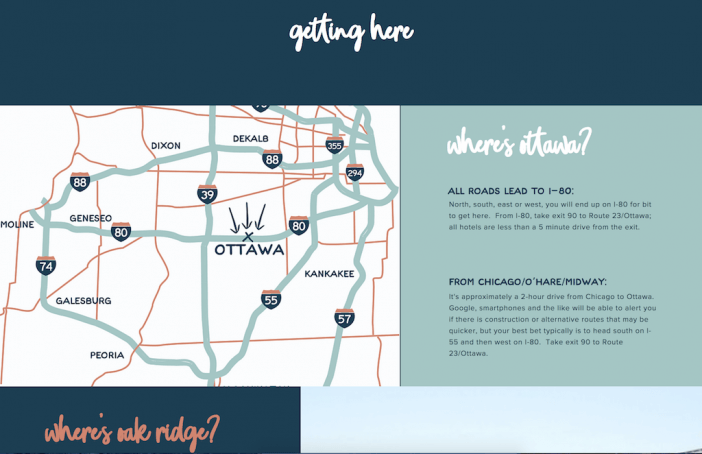
Mary and Bill’s wedding website is a great example of how a simple event theme can be transformed into a fun, personalized website without having to custom-build something complex.
Their “getting there” page has a cool designed map image, directions, and fun fonts and colors — all elements that make their website unique to them without having to spend money on a custom designed website that you’ll only update for a year or two.
The Mirage
Software: Adobe CQ + MGM Resorts
Hosting: Self-hosted by MGM
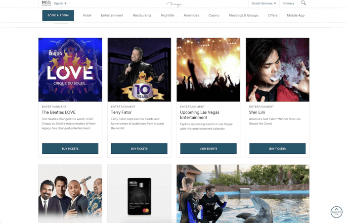
While technically The Mirage is more than an event website (it’s primarily a hotel website), it does serve as a great example of a site that needs extensive event functionality. We particularly liked how this event website example uses a card layout to display upcoming events directly on the homepage. Each card has its own call to action (like buy tickets), so it’s really easy for site visitors to see what’s coming up and then take immediate action on the events they want to attend. It’s simple, but incredibly user-friendly.
Digital Summit
Software: Self-Hosted WordPress
Hosting: GoDaddy
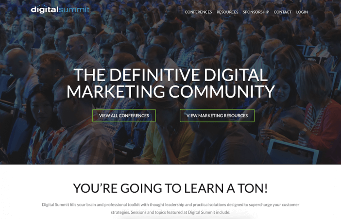
If you’re looking for an event website that can display information for multiple events (i.e. several conference dates), Digital Summit’s website is a great example to use for inspiration. Notice how clear the navigation is — you can either view all events, or you can download resources (another great piece of functionality if you have educational materials to go with your event). Plus, the design is clean and polished, which is right on par with the audience they’re attracting.
Makers to Merchants
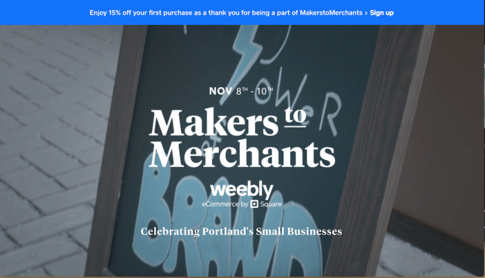
Software: Weebly
Hosting: Weebly
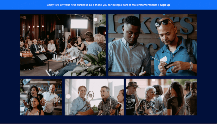
Makers to Merchants is another solid example of an organization that uses a single website to promote several events. This event website uses dynamic elements (like a video header) to add some advanced design and functionality to the site. Notice how this site implements photos from previous events to give readers a feel for what to expect.

The design is straightforward, and the list of events makes it easy to see what’s coming up and RSVP quickly.
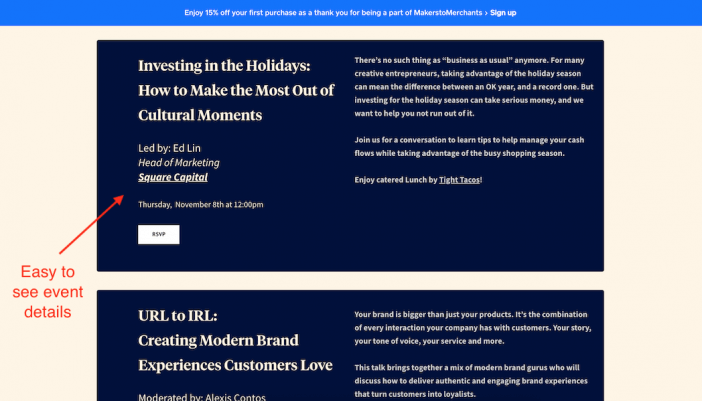
All in all, this is a great example of a straightforward event website that gives readers all of the details they need, as well as a behind-the-scenes look at what the events look like!
Next Steps
Now that you have some inspiration in terms of the design, colors, and functionality you may want in your event website, where do you go from here?
Well, it really depends on where you are in your event website building journey!
If you’re ready to decide on a website builder, check out my guide to choosing a website builder here.
Lastly, if you’re wondering how to market your event website, check out my guide to creating a local marketing strategy!


