If there’s one thorn in your side when it comes to website content, it’s the About page. Whether you’re a company trying to win big business or a freelancer looking to nail your first gig, chances are your About page could be better than it is.
Think about your own Internet behavior. What page do you click to when you are interested in a website, but have never heard of the brand – the About page.
But designing an about page can be daunting. After all, how do you strike the perfect balance between selling your capabilities and getting so self-promotional that you actually drive clients away (or boring them that they are underwhelmed)?
Don’t worry, it’s easier than it seems. Here are six best practices your About Us page should perform, from what content you need to what the design should include (with examples)!
Your About Us Page Should…
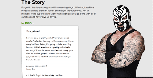
Tell A Story
Your About page is what sets you apart from your competitors. It shows who you are, how you do what you do, and why you’re different. This means your content should speak to those things, too. However, it’s more than just a bio… it’s a story. It’s not about what you do, it’s about who you are.
You know the brand you worked so hard to build, the awards you worked so hard to win, and the team you recruited for so long? Show that off! Your clients want to know about you and the behind-the-scenes. They want to know what you’re all about: what you stand for, what makes you tick, and why they should spend any time looking at what you have to offer. If you feel a little too verbose, stick to facts and figures.
No one can argue with the numbers you’ve achieved.
Who does it well?
Speak to Your Customers
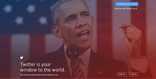
Guess what? Your About page isn’t really about you. Your customers are online searching for what you can do for them. So, instead of rambling on endlessly about yourself, why not speak to them right off the bat? What problems did they come to you to solve? Use their language to solve their wants, needs, or challenges in the first few sentences of your page. This way, you’ll capture their attention, acknowledge their needs, and show you can address their challenges.
Who does it well?
Gain Your Customers’ Trust
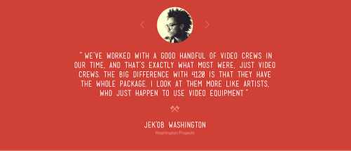
Trust is important both on and offline. It’s harder though to prove online. What’s the best way to show you’re trustworthy and worth your customer’s time? Let them hear from your clients, of course! Customer testimonials are a great way to showcase why other people think you’re awesome — not just why you do. You can also highlight awards you’ve won. Make sure you show some variety. For example, don’t just include office awards, like Best Places to Work. Instead, include customer-centric awards as well to showcase your value to your current clients.
Need a quick and easy way to establish trust? Include your contact information! Nothing spells “scheme” more than a website with no contact info. If you don’t want to include your physical address, at least put a city and state along with your phone number. Don’t forget links to your social handles as well! Social media isn’t just a great way for customers to contact you, but your profiles can also showcase your personality, culture, branding and legitimacy.
Who does it well?
Showcase Your Design
It’s easy to skimp on the design of your About page. After all of the work you put into the rest of the site, why bother going all-out on a page that doesn’t even make a sale? First and foremost, your About page is a step to conversion – a crucial one. So that mindset needs to go.
If you’re like a lot of website owners, you probably pulled out all the stops in phase one of design, but you haven’t updated your About page since you launched. Bad move. Studies show that first impressions on the web are 94% design-related. So if you’re skimping on your design – don’t. Your About page should be visually appealing, on brand, and up to par with the rest of your site. It should also be optimized for all devices, so it looks great on both a phone and a computer.
Who does it well?
Be Visually Diverse
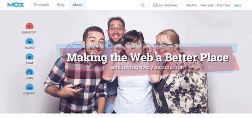
Visuals matter. After all, people remember 83% more when information is presented visually compared to reading. Now, that doesn’t mean you have to make your About page full of photos of videos. However, you don’t want just text either.
A healthy dose of photos and even a short video or two can make a big difference to your page. The variety will help with keeping the audience engaged, and the different media allows you to show character and culture. Use this opportunity to let your true colors shine through! Sure, headshots are interesting… but so is the ping-pong tournament you have every year.
Who does it well?
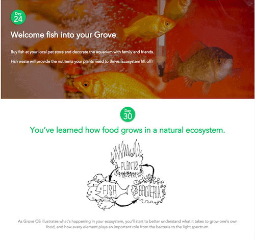
Make An Ask
Think about why a visitor is on your About page – they are interested in you! The very fact that they are on your About page means that they want to know more about your business.
Your About page should tell your visitors what they can do to find out even more about your business. The marketing jargon here is “use a call to action.”
If you have an incredible newsletter, you should let them know and ask them to sign up! If you have a strong Facebook community, you should ask them to like your Page. If you have a high-converting product, page or blog post on you should ask your visitors to go there.
Who does it well?
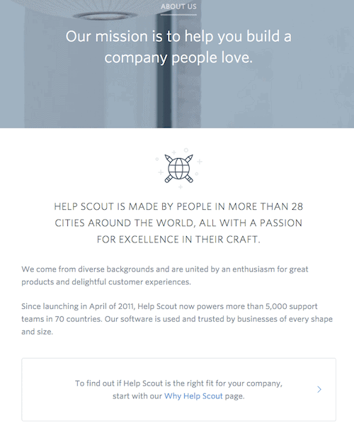
Next Steps & Takeaways
Your About page shouldn’t be a pain… it should be an asset. With great content and an exceptional design, your page can be the difference between someone being just a visitor and becoming a customer.
Your About page isn’t something that’s set in stone. In fact, it should be changed when it needs to be. Watch how it performs in Analytics. Especially look at total pageviews and where it shows in your visitor flow chart. It’s unlikely to ever be a top landing page, but that doesn’t mean it’s not a critical part of your website’s design.
Use these metrics to determine what’s working and what isn’t. Is the exit rate high? You might not be giving your visitors the information they need to move onto your other pages, such as services.
Think an image isn’t working? Swap it out or replace it with a video. Your page is dynamic, just like the rest of your site.
Overall, a great About page can be the thing you need to set you apart from your competition. By investing some time and effort into your page, you can easily raise it to the next level.
Now – go to your own About page and choose 1 small thing to improve right now, and do it.
Related Articles
- How to Build a Minimally Viable Website
- 404 Page Best Practices, Ideas, & Examples
- Contact Us Page Best Practices, Ideas & Examples
- Ecommerce Product Page Best Practices, Ideas, & Examples
- Website Design Best Practices w/ Examples
- FAQ Page Best Practices, Ideas & Examples
- Homepage Best Practices, Ideas, & Examples
- How To Design a Website Layout w/ Best Practices & Examples
- Thank You Page Best Practices, Ideas & Examples
- What Is A Web Design Color Palette and How Do I Make One?
- How Much Is A Website Per Year Explained
- 59+ Ways To Find Free Images For Commercial Use
- How to Improve Your Website Content
- How To Write A Meta Description For SEO
- How To Write A Title Tag For SEO
- Landing Page Best Practices w/ Ideas & Examples


