So you’re creating a personal website, and you’re looking for professional personal website design examples for inspiration and guidance. You’re also wondering which website platform is best to use for your website.
But before we dive into examples of what professional personal websites look like in the wild on a variety of website builders and hosting platforms, there is one thing to keep in mind when you’re evaluating a website: it’s not just about how the websites look. The functionality matters too.
Think of it like buying a car. You have a make / model in mind, and you’re probably looking to see them drive by on the road to see how they actually look. However, you also care about how they operate. Does it accelerate well? Does it have the hauling capabilities you need? How is the gas mileage?
Looking at a professional personal website examples should be done in the same way. We collected the following website examples not just to show you how they look on different platforms, but how they can function, so you can be sure you create a website that fits both the look and functionality you need!
Best Professional Personal Website Examples
We’ve pulled these examples based on functionality, design, and usability. Again, when you’re looking to build a professional personal website, remember that you’re not just thinking about making the site look good.
You want to think about what your site actually needs to do, and find a platform that supports all of your needs.
Melissa Thorpe
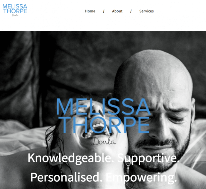
Software / Design: Tailor Brands (review)
Hosting: Tailor Brands
The homepage image is obvious, descriptive, memorable, and powerful. The website’s logo and color scheme all work together while the menu keeps the purpose and call to action simple, minimal, and obvious. It’s great for personal branding in addition to providing complete information for site visitors.
Susannah Rigg
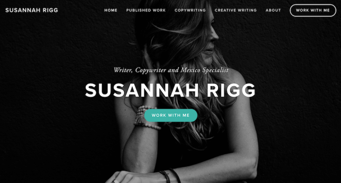
Software: Squarespace (review)
Hosting: Squarespace
This professional personal website stands out for a few reasons. First, check out the homepage. The clear navigation + simple header image (with a strong call to action button!) make it easy for visitors to find exactly what they need.
Next, the portfolio page is a great example of using a card layout with images and text to display your work.

If you’re wondering how to structure your professional personal website in a way that’s intuitive, clear, and polished, this site is a great place to start for inspiration (especially if you have work or content to display).
Brian Smith
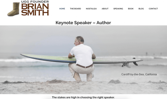
Software: Self-Hosted WordPress (WordPress Setup)
Hosting: Unified Layer
What stands out about this professional personal website is how simple yet effective it is. As soon as your arrive on Brian Smith’s homepage, you know exactly what he’s offering (keynote speaking).
We also liked how the website spells out why you should book him to speak. As you scroll down the page, Brian includes some short copy about what he brings to the table and why the audience would want to hear from him.
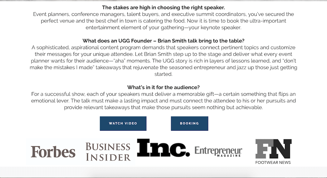
This, combined with the logos underneath, is a great way to build in added credibility and personal branding.
If you’re looking for a way to position your expertise in a way that’s simple and clear, this website is a great place to start for inspiration.
Rational Reminder (Benjamin Felix)

Software: Squarespace (review)
Hosting: Squarespace
This professional personal website takes a unique approach. Benjamin Felix uses his website for his podcast and thought leadership content around investing.
His homepage is a collection of episodes from the podcast, and as you dive deeper into the site, you can learn more about him, investing information, and his firm.
This is a great example to use if you have content you want to display, but also want an easy way to tie it back into your company (his Find an Investor page gives information on how to work with his firm — genius!).
Ian Enders
Software: Minimally-built website
Hosting: Amazon Web Services (learn about cloud hosting)
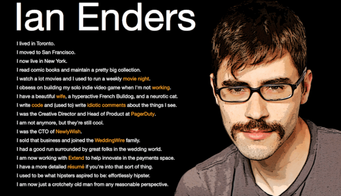
A professional personal website doesn’t need to be a multi-page, in-depth site. In fact, this is a great example of how a single-page site can be incredibly effective for someone who wants to just give a brief overview and link out to other information. It’s like a resume website, but better.
We also liked how Ian showcases his personality in the copy, and added an extra piece of customization with the sketch of him (instead of using a photo). Remember that your personal website should show off YOU personally — which means including a bit of your personality throughout.
Dave Horak
Hosting: Weebly
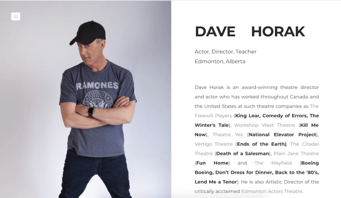
Speaking of showing off your personality… oftentimes, people get so focused on design that they tend to forget that what really matters on a professional personal website is, well, you.
Dave’s site is a great example of how you can build your personal brand and showcase your work without a ton of flair (in fact, great copy will do the trick).
If you’re looking for a simple layout that gives you the opportunity to tell everyone what you’re all about, this one will do the trick.
Meghan Kreidler
Hosting: Wix
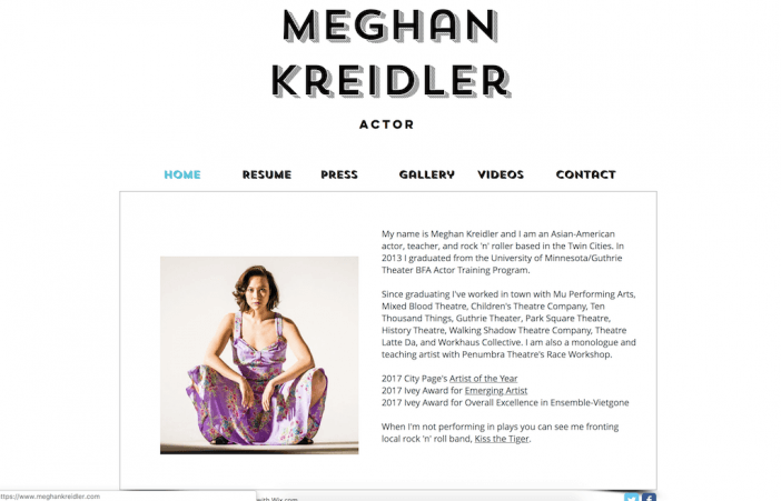
When showcasing your personality and creativity on your professional personal website, you don’t want to sacrifice clarity in the name of creativity. Meghan’s website includes the right balance of both.
The navigation changes the main box content, making it easy to read about who she is, what she does, and what she’s done.
If you’re looking for an easy way to put your work and experience out into the world, this layout does the trick.
Heath Fogg Davis
Software: WordPress.com (review)
Hosting: WordPress.com
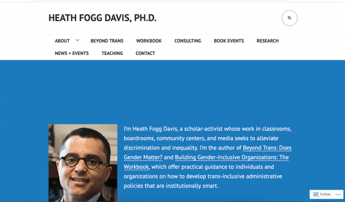
This professional personal website is another example of a straightforward, intuitive website that’s easy to navigate, clear, and gives visitors all of the information they need to learn about you, your qualifications, and your thought leadership.
We particularly liked how Heath lays out his content:

Buy using short paragraphs with “Read More” buttons, visitors can easily skim his information and choose to dive deeper into what pertains to them.
Jasmine Star
Software: Self-Hosted WordPress
Hosting: Amazon
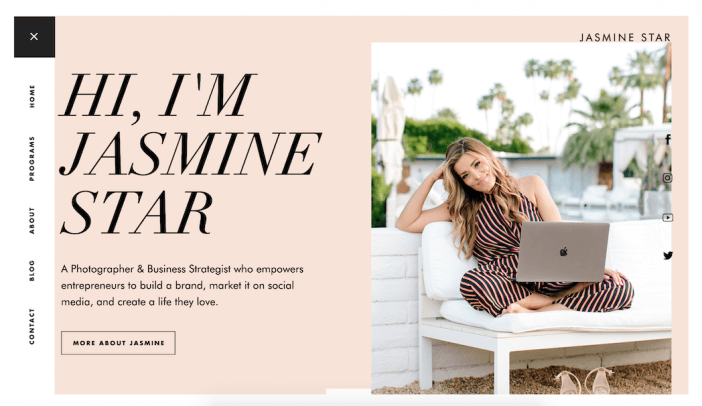
If you’re looking for a more creative approach to your professional personal website, check out this example by Jasmine Star. She takes a different approach than the examples we’ve seen so far. Her site is bright, with large text and plenty of photos. It’s a slightly more creative, yet still polished, look.
We also liked how Jasmine positions herself on her site. When you ARE your brand, there needs to be a lot of, well, you on the site. If you’re wanting to creating a professional personal website for your personal brand, this is a great example to use for inspiration.
Rita Gunther McGrath
Software: Self-Hosted WordPress
Hosting: Peak10
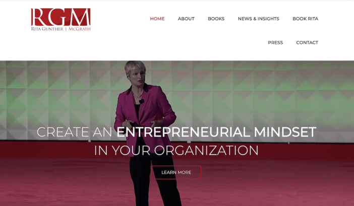
What stood out to us about this professional personal website is how Rita uses a video background header to show her speak. This, combined with a strong headline and call-to-action to learn more, immediately draws visitors in and positions her as an expert.
We also liked how Rita includes a short bio on the homepage:

This is a great way to give visitors an overview of your achievements before inviting them to connect with you further.
Next Steps
Now that you have some inspiration in terms of the design, colors, and functionality you may want in your website, where do you go from here?
If you’re ready to decide on a website builder, check out my guide to choosing a website builder here.
If you’re looking to go DIY with a specific template to match your design and functionality needs, check out my Build a Personal Website: Templates, Design, and Setup Guide.


