A visitor has taken some sort of action on your site… hurray!
Before you celebrate too much, let’s talk about your Thank You page.
The Thank You page is one of the most underrated pages on a website. We often focus so much on getting someone to take an action (like purchasing a product, signing up for a webinar, downloading a whitepaper) that we forget how valuable a Thank You page can be, or the effort we should put into it.
When used correctly, it can be a crucial part of nurturing your audience. But before we dive into some best practices, let’s cover the basics.
What is a Thank You Page?
A Thank You page is where a visitor is taken after completing any desired action on your website. It’s also sometimes referred to as a “confirmation” page because it confirms an action was taken.
A Thank You page can follow up any desired action on your site, from filling out a contact form to subscribing to an email newsletter or purchasing a product on your site.
Do I Need a Thank You Page?
If you have some sort of action you want visitors to take (a “conversion” in marketing speak), then you *absolutely* need a Thank You page on your website.
This page not only serves as a way to confirm the action was taken successfully, but it also allows you to continue to engage your visitors, especially while they’re still “warm” – meaning they’re more likely to want to interact/do business with you.
A visitor who has just taken an action on your site is incredibly valuable because they’re indicating they’re interested in you and what you have to offer. An effective Thank You page is a way to further that relationship and keep their interest growing.
Plus, saying thank you after your audience does something on your site is just plain polite.
Thank You Page vs. Thank You Message
A lot of forms and landing pages include built-in functionality to display a confirmation message once an action is completed. This functionality generally keeps users on the same page and simply replaces the form/download button/purchase area with a thank you message.
While showing this message is enough to confirm the action, in most cases, it doesn’t do much for continuing to engage with your audience. This is where a dedicated Thank You page can do wonders for your post-conversion opportunities.
By leveraging an individual page instead of a message on the existing page, you have more flexibility and opportunities to increase engagement, share relevant content, and provide additional opportunities to convert.
For more about thank you pages vs. thank you messages, check out this article by Hubspot.
Thank You Page Best Practices & Examples
Now that we’ve covered the basics, let’s dive into the details. Here are seven Thank You page best practices you can implement on your own site.
Give Confirmation
The first thing your Thank You page should do is confirm whatever action your visitor just took was completed successfully. For example, if they’ve just subscribed to your weekly newsletter, your page might say something like, “Thank you for subscribing to our weekly newsletter.”
Your Thank You page should also confirm any relevant details relating to the conversion, such as how long it will take you to respond after they’ve filled out a contact form, or when they can expect to receive the whitepaper they’ve opted-in for.
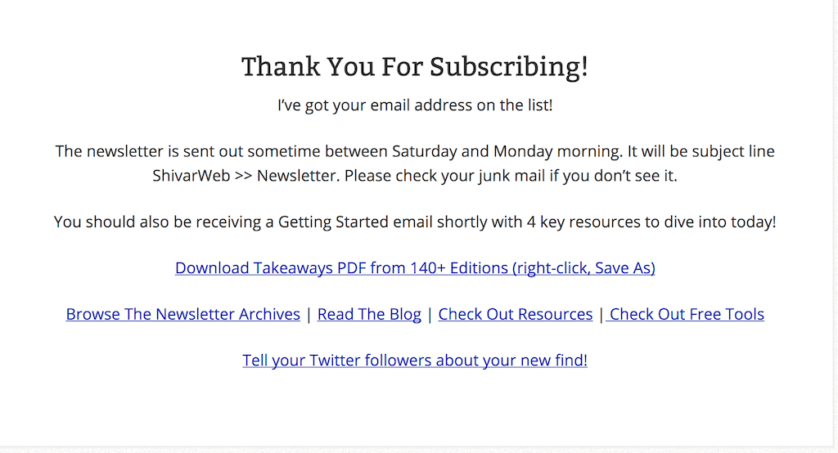
Remember, this is someone who has indicated interest in your business. You want them to feel valued right off the bat and to know that the action they took actually worked. The best way to do that is to confirm all of the details as soon as they finish the conversion.
Include Navigation
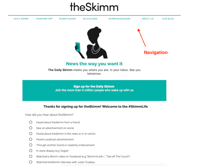
One of the worst things you can do on your Thank You page is keeping your audience stranded there. These are people who have just indicated they’re into what you have to offer, which means this is the perfect time to keep them hanging around your site!
At the very least, your Thank You page should include your website’s navigation to allow your audience to stick around and explore your site some more.
Provide Related Content/Actions
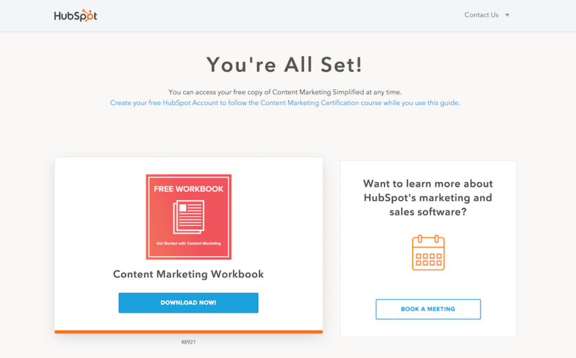
Aside from using your navigation to give your audience an opportunity to stick around, your Thank You page is also a great place to provide related content or additional actions your lead may find interesting.
For example, if they’ve just opted-in to a whitepaper, you could provide related content on the same or a similar subject. This is a great way to continue to “warm up” your visitors (AKA make their interest in you grow) without being overly sales-y.
You could also use this opportunity to lead your users further “down the funnel” (the next step closer to purchasing) by offering another relevant action. For example, Hubspot offers a free session to learn more about their software after you opt-in to download one of their guides.
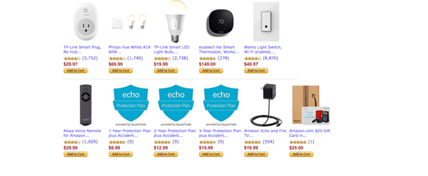
If your Thank You page shows when a visitor has already taken a purchasing action, you can still use related content to keep them engaged. The easiest way to do so is to display related items they may also be interested in — Amazon is renowned for doing just that!
Add an Offer/Promotion
Did a customer just enter to win a free product? Why not offer a coupon code to encourage them to purchase something sooner?
Adding an offer or promotion can be an excellent way to encourage warm visitors to convert, or to increase the value of a converting customer by enticing them to purchase additional items.
Keep in mind that your offer should be something relevant to their action and worthy of their attention. You don’t want to come across as spammy over overly sales-y. You want to provide something that feels uniquely valuable to your audience and relates to whatever action they just took.
Get Social
Encouraging people to connect with you on social media is a great way to further connect with a warm audience.
Instead of just leaving links to your social profiles, take it a step further and tell visitors why they should follow you. What can they expect to see if on they follow you? News about your business? Tips and tricks related to the action they just took? Spell out the value and make it clear it’s worth it.
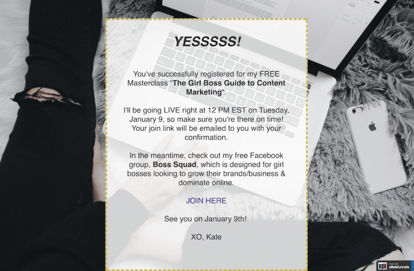
You can also use your Thank You page as an opportunity to spread the word about your business. This works particularly well for actions like webinar registrations and offer redemptions.
If your Thank You page is confirming an offer redemption or webinar sign-up, include social share buttons to encourage your converters to spread the word on social media with their friends. They obviously think what you have to offer is worth signing up for! There’s a good chance they’ll spread the word for you, too.
Show Off Testimonials
Even if your visitor has just completed a purchase, your Thank You page can still be a place of reassurance that you’re as great as you say you are.
Use your page as an opportunity to show off social proof, whether it be customer testimonials, the number of social media fans you have, or a quick stat or case study.
Your Thank You page should continue to warm your visitors and encourage them either to purchase down the road or to purchase again. Using social proof to help reassure them that you’re the real deal can help this process significantly.
Encourage Opt-Ins & Account Sign-Ups
A Thank You page is the perfect time to ask your audience to become a regular part of your community and an ongoing converter.
For eCommerce businesses, asking your purchases to create an account after converting can yield far more results than asking prior to purchase (and can reduce cart abandonment).
If your business doesn’t include the opportunity for customers to create accounts, you can still invite converters to be regulars by asking them to opt-in to your email newsletter on your Thank You page.
Make sure you specify why your audience would want to subscribe to your newsletter — what is it you’ll be offering that makes it worthwhile?
Conclusion & Next Steps
Your Thank You page can be an amazing tool in your sales arsenal if used correctly. Don’t let all of your focus go toward the conversion — spend adequate time on your confirmation page and yield the benefits time and time again.
Start by taking a look at your own Thank You page. Does it confirm the action your visitor took? Does it offer opportunities to stay engaged with your business? If it doesn’t, start by introducing one way for users to continue to interact with you.
Remember, like all pages on your website, your Thank You page isn’t set in stone. Test one approach to adding some meat to your page (like adding related content or a call-to-action to follow you on social media) and see how it works. Then, adapt!
Related Posts
- How to Build a Minimally Viable Website
- 404 Page Best Practices, Ideas, & Examples
- Contact Us Page Best Practices, Ideas & Examples
- Ecommerce Product Page Best Practices, Ideas, & Examples
- Effective About Us Page Design: Best Practices & Examples
- FAQ Page Best Practices, Ideas & Examples
- Homepage Best Practices, Ideas, & Examples
- How To Design a Website Layout w/ Best Practices & Examples
- Website Design Best Practices w/ Examples
- What Is A Web Design Color Palette and How Do I Make One?
- How Much Is A Website Per Year Explained
- 59+ Ways To Find Free Images For Commercial Use
- How to Improve Your Website Content
- How To Write A Meta Description For SEO
- How To Write A Title Tag For SEO
- Landing Page Best Practices w/ Ideas & Examples


