It’s an annoyance for site owners and visitors alike – the 404 page. A visitor types in a URL or clicks a link and expects to land on a certain page, but they get this instead…
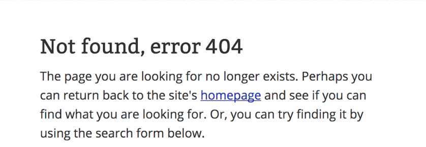
It’s frustrating, but it’s also a part of life on the web. Mistakes will be made, and error messages will happen.
But it doesn’t have to be all doom and gloom. In fact, you can turn your website’s error page (also known as a 404 or Page Not Found error) into a positive experience for your visitors.
But before we get there, let’s cover a few of the basics.
What is a 404 Error?
A 404 is the error page your server shows when it cannot find the page someone is looking for on your site. It is also known as a Page Not Found error because it is shown when a specific page within a live website cannot be found (if the entire website were down, a different error would show).
4o4 pages are usually shown when someone mistypes a web address, or if a page has been taken down and a redirect to a different page has not been set up.
Why does it matter?
A 404 error page is actually a necessity because it lets a user know that whatever they’re looking for cannot be found.
And while a 404 page isn’t necessarily a bad thing, it shouldn’t be caused by your own internal links. This means that whenever you link to another page on your site, you should always be pointing to an actual page — not a “page not found” error code.
To make sure none of your internal links are rendering a 404 page, use Screaming Frog to do a scan of your site’s pages. You can also use the Chrome browser extension, Check My Links, to do a quick scan of the page you’re currently on. If you are specifically looking for Googlebot 404s, you can check your Search Console report.
But even if you have all of your ducks in a row when it comes to internal links, your website visitors are human. There’s always a chance of a URL typo that will bring up your 404 page. There’s also the possibility that others who link to your site may link to an outdated page that does not have a redirect, or may type the URL incorrectly – which will also render a 404 error.
As such, it’s important to have a page that clearly communicates the error and provides a good user experience (more on that in a minute).
When to Redirect vs. When to 404
Like anything on your website, the decision to implement a redirect (when you automatically send a user to a new page when they type in an old URL) or to show a 404 error page isn’t black and white. It all depends on user experience.
Let’s say you have a page that ranks high in search engines and includes a ton of external links to it. For some reason, you take it down. In this case, you’d probably want to create a redirect to something similar and reach out to the external linkers to get the links replaced with the new content.
In other cases, it may be better to use a 404 page because it clearly shows users the information that they’re expecting to see doesn’t exist. For example, if you expect to land on a blog post about the best dog toys for large dogs, but end up on the brand’s product page for dog toys instead, you’d probably be a bit confused (and maybe even frustrated).
404 Page Best Practices
Now that we’ve covered the basics, let’s dive into some 404 page best practices that you should be using on your own site.
Explain What’s Happening
Have you ever landed on an error page full of technical jargon like “Internal server error” or “File or directory not found”?
It’s frustrating, isn’t it?
Don’t make the same mistake on your 404 page. While a lot of error pages come with standard 404 messaging like “page not found” or “there’s been an error”, take the extra step to make sure the copy on the page is rid of technical website jargon and explains what went wrong in an understandable way.
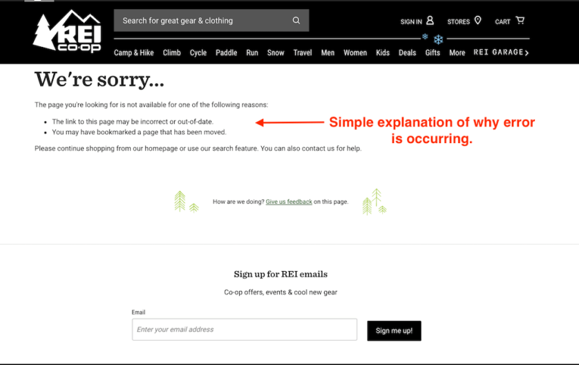
Ex: REI
Remember that a lot of searchers aren’t even aware of what a 404 error is, which means it’s on you to break down what’s happening when they hit the error page.
Be Consistent with Your Brand
Out of the box, 404 pages are rarely a thing of beauty. And while your page doesn’t need to be masterfully designed, it should fit in with your overall website design and brand voice.
To make sure it does, put some sort of branding on the page (or at least make sure your site navigation and logo appear at the top). You’ll also want to be sure that any additional elements on the page (like photos, colors, and fonts) fit with your site’s color palette.
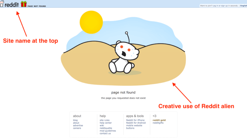
Ex: Reddit
When it comes to the actual copy on the page, keep it warm and welcoming. A 404 error shouldn’t be a disaster, and your copy should make that clear. You’ll also want the copy to match with your overall vibe (i.e. if you’re cheeky on the rest of your site, be cheeky here).
Give Them Somewhere to Go
The last thing you want someone to do when they land on your 404 page is hit the back button. Unfortunately, this happens all the time.
Why? Because there’s nowhere to go! Take this error from Bank of America. There’s no action to take but to reload the page or head back to wherever you were before this page.
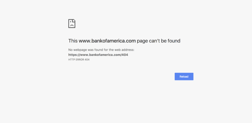
Don’t fall into this trap. Make sure your 404 page invites people to go somewhere else on your site. A standard practice is to leave a link to the homepage at the very least, so users can navigate to the start of your site. It can also be good to include a search bar so users can search for exactly what they were looking for when they initially landed here.
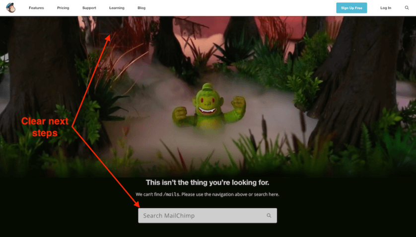
Ex: MailChimp
But Don’t Overwhelm
You want to give users an option of where to go from your 404 page — but this doesn’t mean dump every link you have on them and make them choose without any context.
To ensure your 404 page provides a good user experience, limit the links on the page to a few key ones, like your homepage and contact page. No matter which links you choose, make sure you include the homepage for those users who aren’t totally sure what they’re looking for yet.
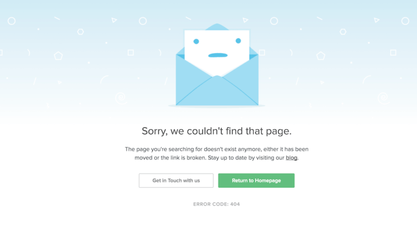
Ex: Litmus
Get Creative
A great 404 page can be the opportunity to change a visitor’s feeling about their whole experience with you. You can take a user from frustrated to satisfied just by using a bit of creativity on your page.
One of the easiest ways to do this is to weave a bit of humor into it. Take this clever 404 page from LEGO, which uses Legos to convey the error.
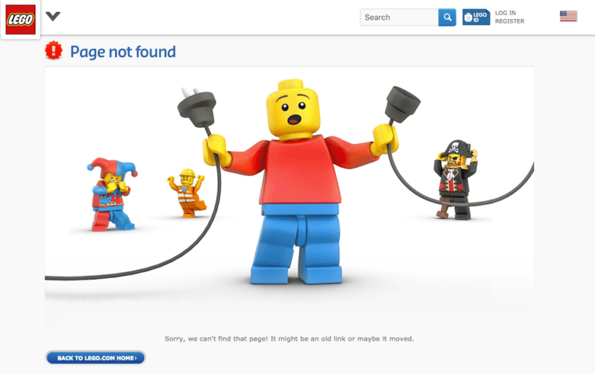
Keep in mind that however you represent the error on your page, it needs to fit with your overall brand. For example, if you’re an attorney, you may not want to make jokes on your 404 page. But this doesn’t mean you can’t get creative! Take Chase as an example:
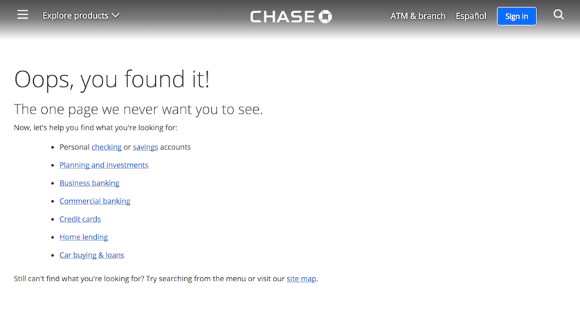
They do a great job of adding a touch of creativity with their copy while still keeping things professional.
Additional 404 Page Inspiration
Looking for extra inspiration for your 404 page? Here are a few more that we love:
Bloomberg
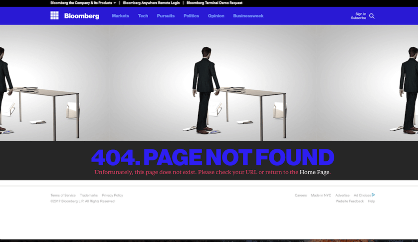
This 404 page from Bloomberg animates a businessman destroying his computer and then combusting. The clever use of animation and humor makes landing on this error page actually worth it!
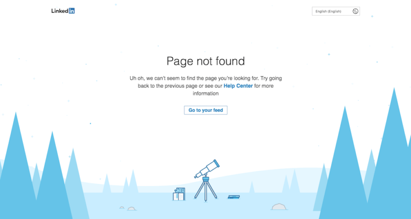
You don’t have to be a creative genius to have a good 404 page. Sometimes simple is better. We like LinkedIn’s because it’s straightforward. The moving telescope is a nice touch, too.
NPR
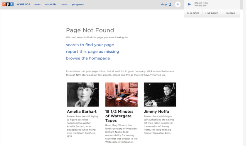
NPR does a great job of giving the user the right number of options for a next step and adding a bit of humor with their stories about lost people, places, and things. Bonus points for adding a place to report the page as missing. This is a great way to make sure they’re accounting for non-user errors.
Chargebacks911
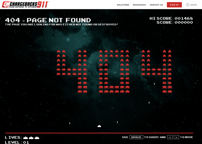
Chargebacks911 actually made their 404 page fully interactive & entertaining. They’ve added an old 80’s retro game that you can actually play. It’s a very creative way to build a brand voice, entertain users…and build links TBH.
Conclusion & Next Steps
There’s always a chance of someone getting a 404 error on your website — it’s up to you to make the experience a good one.
Remember that your 404 page has the opportunity to change a user’s experience with you. It’s an excellent opportunity to take a frustrated visitor and turn them into a fan of your business.
At the very least, a good 404 page clearly explains the error, why it might be happening, and gives visitors a path to follow to continue interacting with the rest of the website.
To take your page up a notch, try weaving in some of your brand personality a bit more. Play with creativity and humor (if appropriate). You never know when a good 404 page can turn someone into a brand advocate or loyal customer.
And be sure to look into reclaiming an inbound links to 404 pages. That can be the quickest SEO win possible.
*hint – and you can also take advantage of 404s on other websites for your content & SEO benefit.
Related Articles
- How to Build a Minimally Viable Website
- Website Design Best Practices w/ Examples
- Contact Us Page Best Practices, Ideas & Examples
- Ecommerce Product Page Best Practices, Ideas, & Examples
- Effective About Us Page Design: Best Practices & Examples
- FAQ Page Best Practices, Ideas & Examples
- Homepage Best Practices, Ideas, & Examples
- How To Design a Website Layout w/ Best Practices & Examples
- Thank You Page Best Practices, Ideas & Examples
- What Is A Web Design Color Palette and How Do I Make One?
- How Much Is A Website Per Year Explained
- 59+ Ways To Find Free Images For Commercial Use
- How to Improve Your Website Content
- How To Write A Meta Description For SEO
- How To Write A Title Tag For SEO
- Landing Page Best Practices w/ Ideas & Examples


