How much thought did you put into your Contact Us page on your website?
If you’re like most businesses, you probably focused on the method (i.e. how people can contact you) but didn’t give much thought to the page itself (i.e. the copywriting and design).
In reality, the Contact page should be one of highest priority pages on your site because it’s one of the most visited pages. It’s also typically the beginning of your interactions with potential customers.
With that in mind, let’s talk about how to make a killer Contact Us page that will stand out to your visitors.
Make it Functional
This should go without saying, but you should always test your contact page to make sure it’s fully functional.
Test all email and phone links, fill out any forms, and check integrations you may have with external databases for yourself. Never assume they work.
If you’re running automated responses to contact requests, make sure those are firing, too.
The last thing you want is for a potential customer to attempt to reach you and never hear from you again.
Include the Right Information
The type of information you include on your Contact page will depend on your business. In general, you want to include information about your operations and how your customers can get in touch with you.
Here are a few typical pieces of information a Contact page should include:
Phone Number
Email is great and all, but a lot of people still prefer to call directly. Don’t miss out on a chance to connect with these potential customers by leaving off your phone number.
Hours of Operation
If you’re only open certain days of the week, let your visitors know to give them an idea of when they should expect to get in touch with you.
Response Time
Set an expectation of how long someone should expect to wait until they hear from you.
Email Address
If you don’t include a form, make sure you give people a way to reach you via email. You should never limit your audience to one way of contacting you.
Social Handles
Give your visitors an easy way to engage with you on other mediums by linking to your social media profiles.
Location
Adding your physical address to your Contact page is a great way to build trust with your visitors. If you have more than one location, be sure to list contact methods for both.
Unfortunately, it’s not just enough for your page to have the correct information — it needs to be properly formatted, too.
Your Contact page is home to your website’s other contact methods, like your phone number and address. These elements should be in readable formats for machines like Schema, hearing TTY and visual readers, in addition to marketing tools like Googlebot, which need to crawl your page.
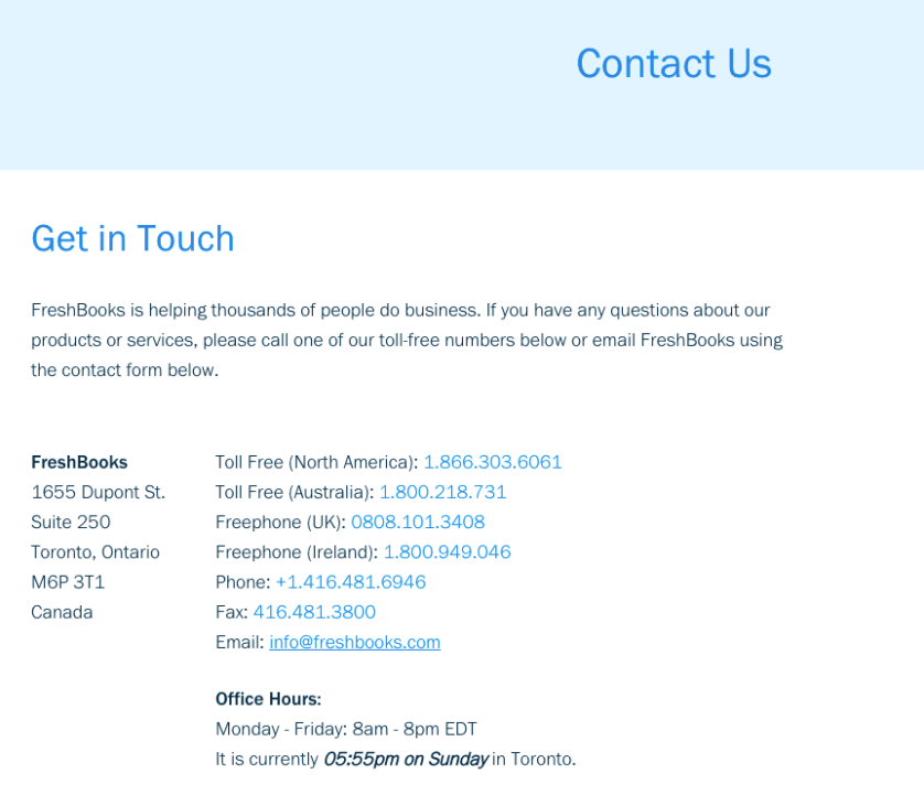
Ex: FreshBooks
Keep it Organized
Similar to a complex FAQ page, Contact pages can become robust for businesses’ that have multiple teams or functions that may require different contact methods.
The key to any complex page is to keep it simple for the user — which means organizing the page to make sure your visitors find exactly what they’re looking for with minimal effort.
If you have different ways for your customers to contact you based on the contact purpose, i.e. Sales, Technical Support, Press Inquiries, etc., organize your main Contact Us page with these categories in order to help direct your visitors to the right contact method.
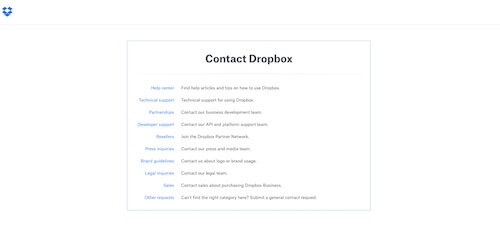
Ex: Dropbox
Keep your bases covered by including an “Other” or “General” category for those who may not find what they’re looking for in the list.
Make it Easy to Find
Imagine you’re trying to find contact information on a company’s website and can’t locate it anywhere. Do you leave the site in frustration?
Yes.
Don’t let this happen to your customers. Your Contact page’s location should be predictable based on the action you want your customer to take while on your site.
If the main point of your site is to have customers get in touch with you, then your Contact Us page should be in the main navigation.


Ex: CP+B
If it’s a secondary purpose of your site, then the page should be someplace predictable, like in the footer of your site.
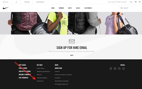
Ex: Nike
It all depends on what action you want your customer to take. Based on that action, you should be able to determine the location of the page — just keep it predictable. If your target customer wanted to contact you, where would they look to do so?
Be Clear and Concise
Think of someone contacting you as a potential sale — you don’t want to do anything that might prevent them from finishing the process and becoming a customer. That’s money potentially lost.
Your Contact Us page should be clear and concise, with no barriers for users to get hung up on. Keep your copy short and to the point. You’ll also want to include a clear call to action that tells the visitor exactly what you want them to do on the page.
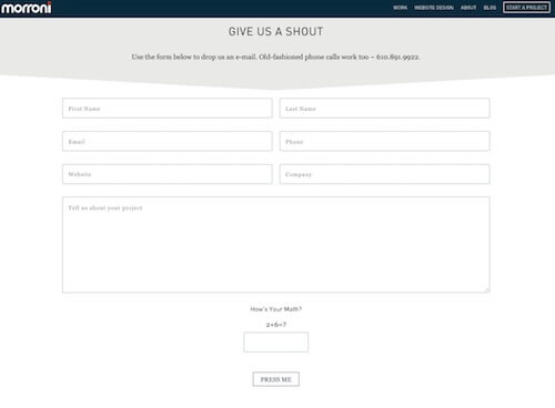
Ex: Morroni
However, don’t think clear and concise = boring. What it really means is removing anything that doesn’t serve a specific purpose, like fluff copy, excess form fields, etc. Your Contact page can (and should) still be creative without inhibiting a visitor from actually contacting you.
Speaking of being creative…
Showcase Your Brand Personality
Think of your contact page as an extension of you. Its style should reflect your brand because this is often the first interaction customers are having with you.
From a design perspective, your Contact page should fit in with the overall look and feel of your website. This means going beyond slapping a contact form on a blank page and calling it a day.
Your Contact page is an opportunity to give your visitors a taste of what it’s like to communicate with you, so get creative, both with your design and with your copy. Again, keep your language clear and concise, but don’t be afraid to have fun with it. Your page should entice visitors to fill out your form, give you a call, shoot you an email, etc. — not bore them to tears.
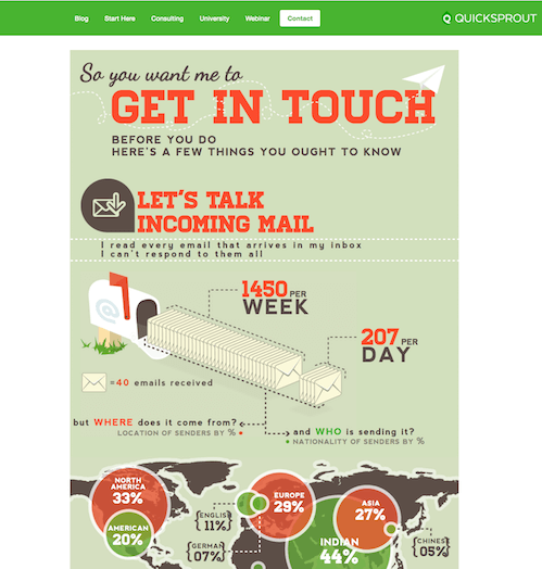
Ex: Quick Sprout
Extra Contact Us Page Inspiration
Need more inspiration? Here are three examples of Contact Us pages that are hitting all the marks:
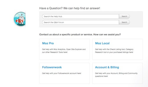
Moz: Notice how Moz takes organization to a new level with their search functionality. Not only can you search the Help Hub, but you can also look at the Q&A forum to find answers to your questions. Below that, Moz has specific areas you can get help with organized by function.
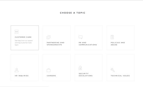
Squarespace: Not only does Squarespace organize their contact options and keep copy clear and concise, but they do it within the minimalist style their platform is so well-known for.
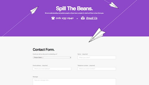
Marble: With a clean, unique design that includes multiple methods to contact Marble, this Contact Us page stands out as a clear example of what to follow.
Conclusion & Next Steps
Your Contact page is an opportunity to start a conversation with potential customers or continue engaging with existing ones. This means your page should be a priority when it comes to your website design and structure.
Make sure your design and copy are clear and concise. Remove anything that might prevent someone from actually contacting you (like longer-than-necessary forms, too much copy, etc.).
Don’t forget to provide valuable business information for your customers as well as a clear call to action for them to get in touch with you. Lastly, make it unique! This is a customer service touchpoint, which means your Contact Us page should represent your brand and what it’s really like to communicate with you.
Related Posts
- How to Build a Minimally Viable Website
- 404 Page Best Practices, Ideas, & Examples
- Website Design Best Practices w/ Examples
- Ecommerce Product Page Best Practices, Ideas, & Examples
- Effective About Us Page Design: Best Practices & Examples
- FAQ Page Best Practices, Ideas & Examples
- Homepage Best Practices, Ideas, & Examples
- How To Design a Website Layout w/ Best Practices & Examples
- Thank You Page Best Practices, Ideas & Examples
- What Is A Web Design Color Palette and How Do I Make One?
- How Much Is A Website Per Year Explained
- 59+ Ways To Find Free Images For Commercial Use
- How to Improve Your Website Content
- How To Write A Meta Description For SEO
- How To Write A Title Tag For SEO
- Landing Page Best Practices w/ Ideas & Examples


