If there were an award for “webpage that customers visit most and website owners think about the least” – the FAQ page would likely come in close second to the About page.
In a way, the FAQ page is simply a Miscellaneous content stuff page or a “every other website has one, so we should too” page that customers look at.
Many content strategists argue that you should not have one at all.
But FAQ pages have been around for so long that customers usually hunt for them.
I mean – just think about it as a user. What do you like to click on when researching a product line? Do you like reading through FAQs?
They can serve a very useful purpose if you think through them step by step. Here’s some starting points & FAQ page best practices to use when creating your own website’s FAQ page.
What is an FAQ Page?
An FAQ page is a webpage dedicated to listing and succinctly answering frequently asked questions from website visitors.
FAQ pages have been around since before the modern commercial Web.
They originated on Usenet groups both as a navigational tool and as stand-alone curated content. Ecommerce websites adopted the format, especially since online buyers could not physically examine products or talk to a sales rep.
Usually they are formatted with drop-downs, long-lists, bullets or other unique formatting.
Unfortunately, FAQ pages have also been used for miscellaneous catch-all content pages or as band-aids for bad user experience.
Should I Have an FAQ Page?
Ideally, your website would answer all customer questions as they crop up. The best user experience anticipates and solves problems before the user has to solve the issue themselves.
Think about little scroll overs and text within buttons that frame expectations.
That said, FAQ pages are a known-page for users. It can be a nice reassurance for customers — there if they need it, but hopefully they don’t have to actually use it.
Really, it comes down to three questions.
- Are there frequent questions your customers are asking that can’t be easily addressed in an existing section of your website?
- Is your sales/service team (or your own inbox) constantly dealing with recurring product and service questions?
- Are there outlier customers & use cases that would distract from your target audience if you addressed them in your primary content (ie, death by footnotes)?
If so, an FAQ page is for you.
Don’t create another page as a band-aid for bad website content or just for the sake of having one. If your site can answer questions without calling it out on a separate page, then bite the bullet and just fix your website copy.
FAQ Page Best Practices
So what makes a good FAQ page?
Like most marketing questions – it depends. You have to break the problems down into components and solve each issue for your website.
Here are common starting points for structuring your page.
Find & answer real questions
You need to answer real questions. If you can anticipate a question – then you should figure out a way to answer it within your existing content when that question will crop up.
Inventing questions for the sake of answering them creates confusion and noise.
In fact, if you have ever chatted with customers, usually the questions they ask are totally different than the ones that you’d expect.
If you want to create educational content – then create proper educational content (ie, a Buyer’s Guide or a How To post). Don’t shoehorn a buyer’s guide into an standalone FAQ page.
You can find these from a variety of sources: your sales/customer service department, a feedback form on your website, or even your own email. You can also check out your social media channels — people love asking questions on a business’ Facebook page! You can also venture out into keyword research land for questions people are asking on other platforms.
Make questions relevant & timely
Your customers shouldn’t be asking the same questions over a long period of time.
Either solve them within your website content or make sure you’re updating your FAQ page frequently to address new questions that arise, or to account for seasonality changes if those affect your business.
Be clear & concise
Keep questions & answers simple. Make sure the questions are clearly worded and the answers focus on providing a solution, not creating more questions or options.
Once you have your questions and answers down, you’ll want to put some thought into how to organize your FAQ page.
If you’re lucky, you may just have five basic questions that need answering. In that case, a standard FAQ will do.
But, if you’re like the many brands who have questions upon questions on their FAQ page, you’re going to want to organize the information to provide the best user experience possible for your visitors.
The goal is to make sure they can find the information they’re looking for quickly and easily.
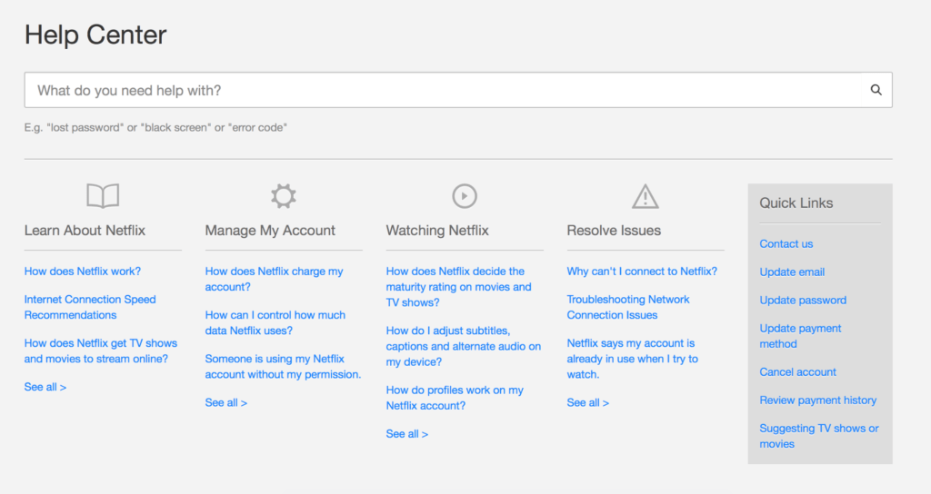
Batch questions together
You want your FAQ page experience to be seamless. So, consider organizing your questions by category with noticeable headlines, so customers can easily jump to the section they’re looking for.
Ex: Netflix
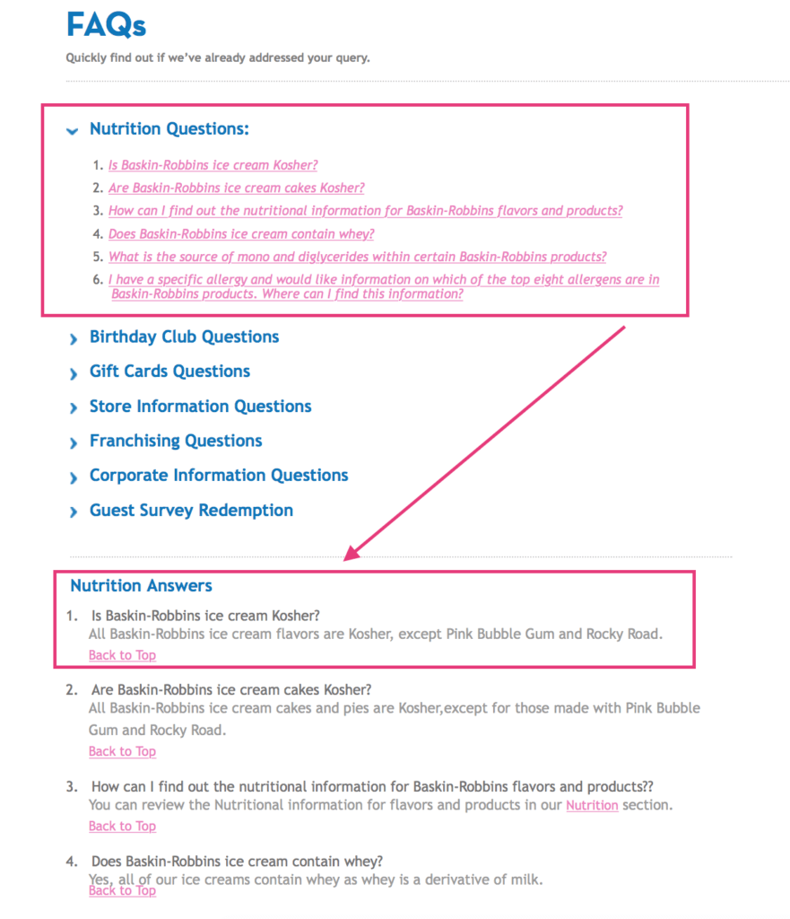
Put answers further down the page
Kissmetrics suggests grouping questions together at the top of the page to provide users with easy scanning.
You can then duplicate the questions with answers at the bottom of the page, and use the “jump” feature to move your users to the answer once they click a question.
Ex: Baskin-Robbins
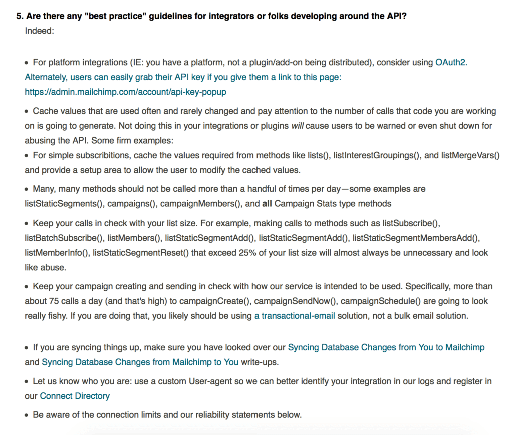
Link out to external sources
While you don’t want to send customers in circles, an FAQ page can be a great place for internal linking.
Just make sure that whatever you link to supplements your answer, not speaks for it.
Ex: MailChimp
Getting the Most out of Your FAQ Page
Now that you’ve got your best practices down, it’s time to go a bit deeper. An FAQ page is filled with opportunities if used the right way. Here are just a few tips, tricks, and ideas on how to get the most out of your FAQ Page:
Use custom retargeting
When users hit your FAQ page, you have a unique audience at your fingertips. Some of these visitors need just a bit of reassurance that they’re making the right choice before converting, but they do have a high intent to buy.
So, go ahead and create a small, highly customized retargeting campaign that pitches a demo/sample or free return. Reassure them by letting them try out your product/service with no strings attached.
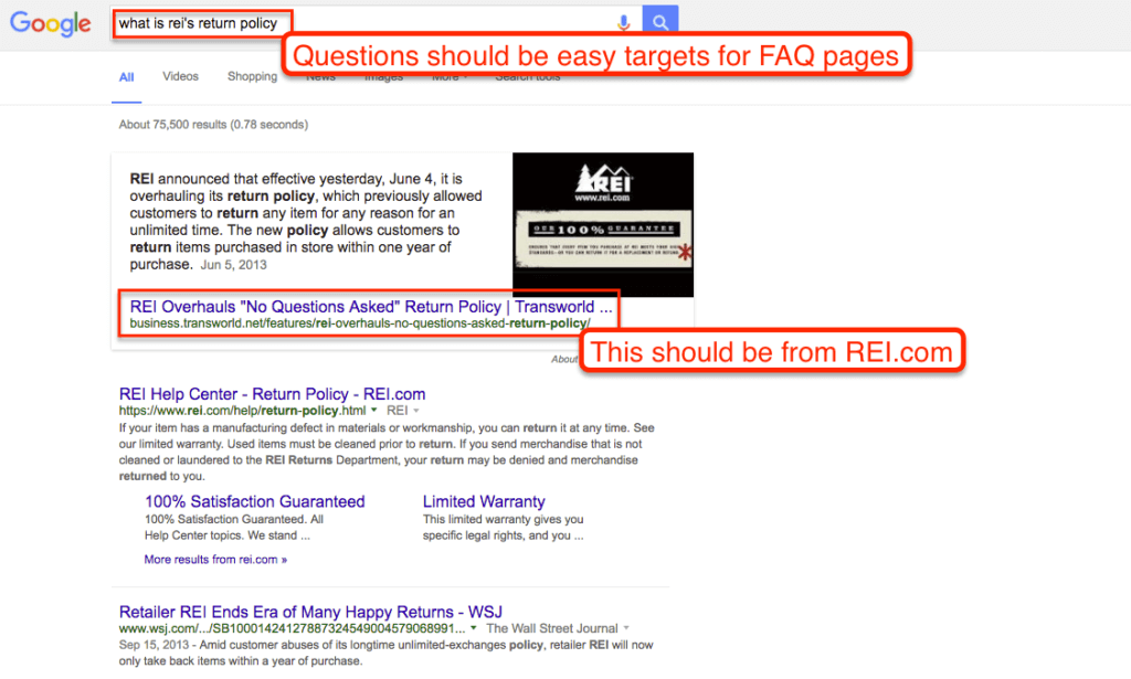
Target Google Rich Answers
If you haven’t noticed – Google has been serving more “rich answers” directly within search results.
Because of their question/answer structure – FAQ pages can be a natural fit for targeting these keywords.
In fact, Google has recently begun recognizing actual FAQ “schema” that it will pull directly into the search results.
Emphasize education
Remember how I mentioned linking out to supplementary content?
Using your FAQ page as an educational tool is an excellent way to help your visitors become better informed about your brand and the problems you solve.
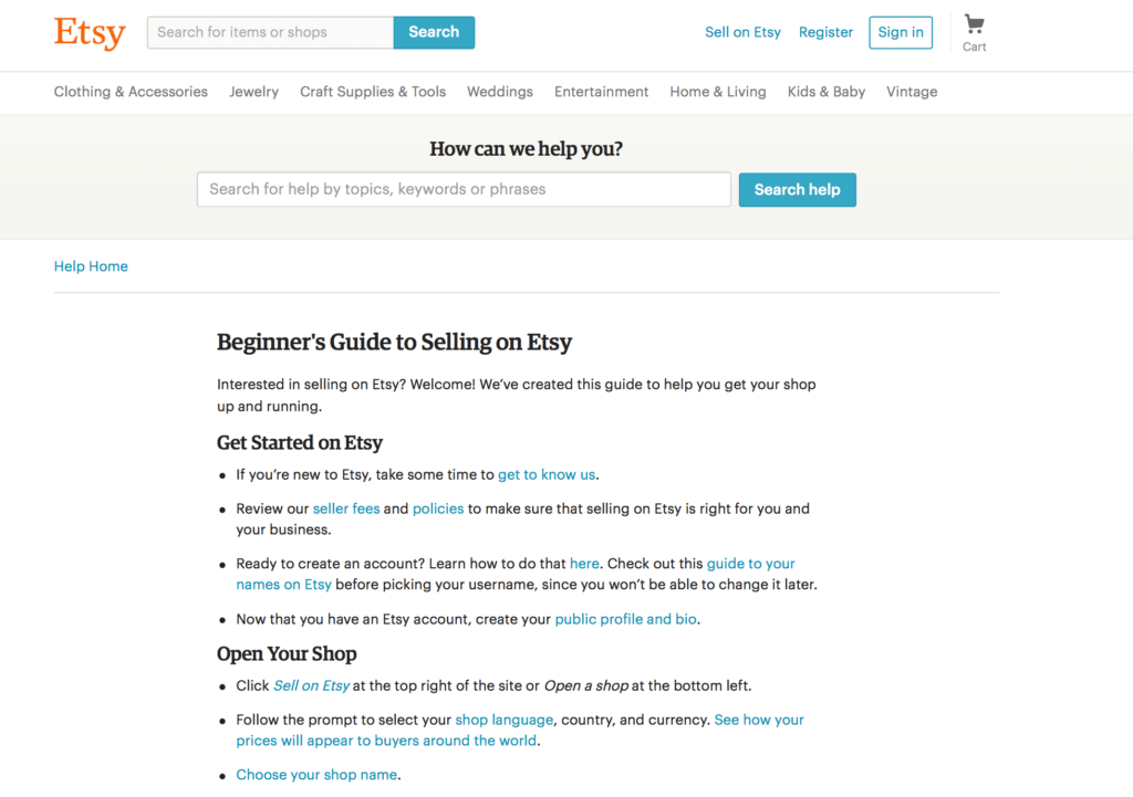
When answering a question, try linking out to an article that expounds on the issue you’re solving. When you orient everything towards education your customers, you’ll be surprised how much it can increase trust in your brand.
Ex: Etsy
Build your brand’s voice
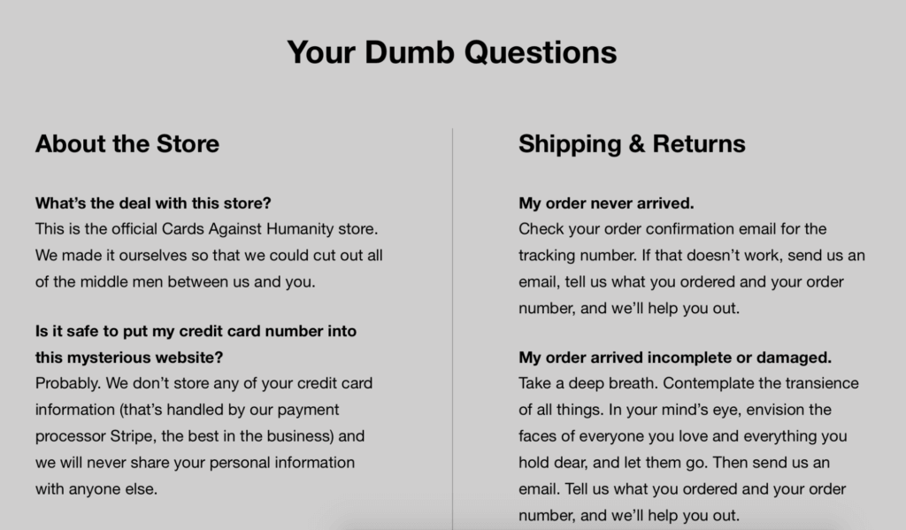
Although you’re being clear and concise, the FAQ page is still a great opportunity to build out your brand’s tone of voice.
Keep in mind that an FAQ page is a customer service touchpoint, meaning it’s often where customers are frazzled or in the worst of times – frustrated.
This is an opportunity to show that your business handles that with kindness and consideration. Or, if you’re like Cards Against Humanity, it’s the time to let your caustic nature shine.
Extra Inspiration
Need more inspiration? Here are three examples of company FAQ pages that are hitting all the marks:
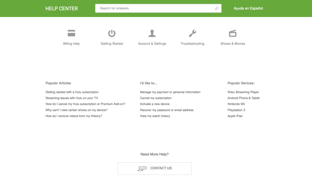
Organization & Education
The “help center” on Hulu’s website is organized well. Notice how the top section is categorized by question category, while the bottom is broken out by resources, actions, and popular devices. Plus, the search feature helps users find answers even faster.
Optimal User Experience
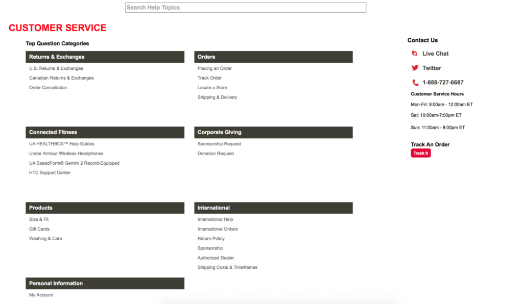
With its top questions categories, educational assets, search function, and multiple contact methods, Under Armour is making sure its customers have access to all the information they need.
Product & Service Focused
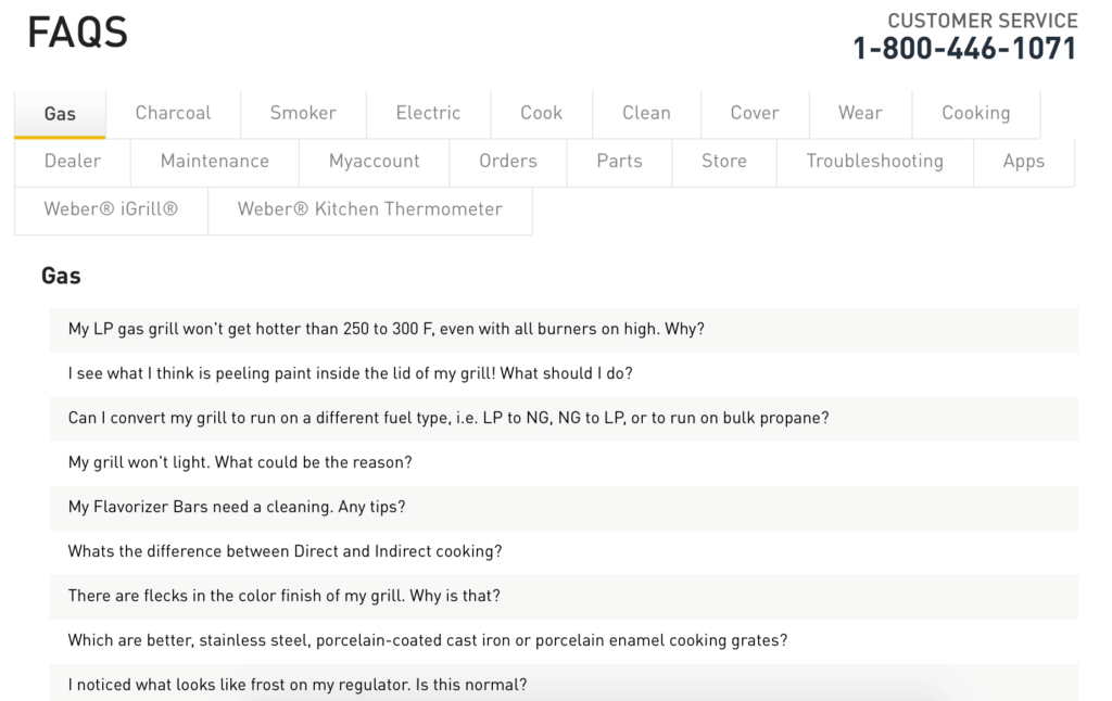
Weber’s straightforward FAQ page is broken out by product type and various actions customers may have questions on (like orders).
This unique organization is a great example of an approach that works for Weber’s audience, but may not work for another eCommerce site (like the Gap).
Conclusion & Next Steps
Your FAQ page shouldn’t be a crutch for bad design and boring content. It should be an opportunity for educating your customers and providing them with valuable information.
In order to get there, start by doing some in-depth research on what your customers really want to know. Then, organize those questions and answers on a way that makes sense for your site and business structure.
Lastly, make sure you look for opportunities to link to educational resources and to infuse your brand voice and personality into the copy. After all, this is a customer service touchpoint. You want the experience to make your brand — not break it.
Related Posts
- How to Build a Minimally Viable Website
- 404 Page Best Practices, Ideas, & Examples
- Contact Us Page Best Practices, Ideas & Examples
- Ecommerce Product Page Best Practices, Ideas, & Examples
- Effective About Us Page Design: Best Practices & Examples
- Website Design Best Practices w/ Examples
- Homepage Best Practices, Ideas, & Examples
- How To Design a Website Layout w/ Best Practices & Examples
- Thank You Page Best Practices, Ideas & Examples
- What Is A Web Design Color Palette and How Do I Make One?
- How Much Is A Website Per Year Explained
- 59+ Ways To Find Free Images For Commercial Use
- How to Improve Your Website Content
- How To Write A Meta Description For SEO
- How To Write A Title Tag For SEO
- Landing Page Best Practices w/ Ideas & Examples
