So you’ve decided to build your own website. You’ve probably already been thinking about color palettes, even if you’re not quite sure what they really are or why they’re such a big deal.
But when it comes to designing your site, choosing the proper color palette is one of the most important web design decisions you’ll make.
Color increases brand recognition by 80%, which means picking your web design color palette is essential to making your website not just enjoyable and engaging to your audience, but memorable, too.
Before we dive into how to select the right color palette for your site, let’s cover some color basics.
What is a website color palette?
A website color palette is the combination of colors your choose for your site’s design. You’ll stick to using these colors throughout your whole site.

Ex: WordPress
Color palettes are used to make sure your website colors coordinate. It’s a way of organizing colors that not only look good together, but work well throughout your site based on the message you’re trying to get across, the emotions you want associated with your brand, and the action you want customers to take on your site.
Why is a color palette important for my website?
You know you want your site to look good… and a color palette is half the battle in making sure it does.
But choosing the right color palette is about more than just having a pretty site. Color has a huge influence on our perceptions, making it a powerful tool in your design arsenal.
Color has emotional and psychological effects on viewers. Different colors evoke different emotions, which means using color strategically on your website helps you communicate the message you want to your customers to receive.
For example, let’s take the color blue. Blue typically makes people feel something is trustworthy and dependable. Brands who use this color in their color palette include the likes of Chase. I’d say a financial institution would definitely want to seem trustworthy… wouldn’t you?
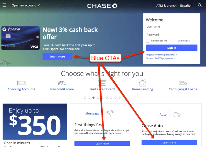
Ex: Chase
Color also affects your overall perception of a brand by influencing the website’s design. If the colors clash, the design looks bad, and visitors get a bad impression of your site and business. Let’s look at two websites to dive a bit deeper.
Website #1 has a ton of information, but clashing colors. The font is all sorts of different colors, the background is blurry, and the photos are different sizes and quality.

Would you spend a lot of time here? Probably not.
With a color scheme like this, it’s easy to feel the brand is untrustworthy, unorganized, unprofessional, etc. If you were buying a product or service directly on the site, you probably wouldn’t feel too secure in doing so, because the site itself looks unprofessional.
Now let’s look at site #2:

There are still photos, colored backgrounds, and even different text colors… but it all fits into a cohesive color scheme, making the brand look polished and trustworthy.
Which business would you choose for your water technology needs?
That’s the power of color.
Understanding the Basics of Color
Before you can choose your web design color palette, you need to understand the underlying importance of colors and how they interact together. This is often referred to as Color Theory.
Entire books have been written about Color Theory — so instead of doing a deep dive, I’ll cover the basics you need to know to help you choose a great color scheme for your website. If you want more information on Color Theory, check out this article.
At its most basic level, color theory refers to the interaction of colors in a design through contrast, complementation, and vibrancy.
Contrast, Complementation, Vibrancy
Contrast
Contrast is how you divide elements on your website. Think about it in terms of black and white… literally. These colors create contrast; they completely juxtapose each other. If you have a black background with white text, your eye is drawn directly to the text. Contrast also helps readability by ensuring you can actually see what’s on the page.
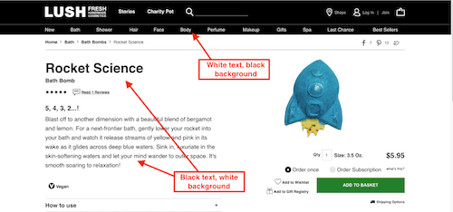
Ex: Lush
Complementation
Complementation is essentially how colors look with other colors. Complementary colors are opposites on the color wheel and provide balance for the eye (more on that in a bit). Complementation can be a great tool to help you choose which colors look good together.

Ex: HostGator
Vibrancy
Vibrancy is the mood a color sets. Bright/warm colors are typically more energizing (think reds and yellows), while cool colors typically make us feel calmer (think blue and green).

Ex: Huge
These interactions between colors and facets of colors are what make up color schemes. Think of a scheme as a blueprint for choosing what colors go together. They are created by working within color families in the color wheel and with the elements of color theory. Your color scheme is what you use to choose your color palette.
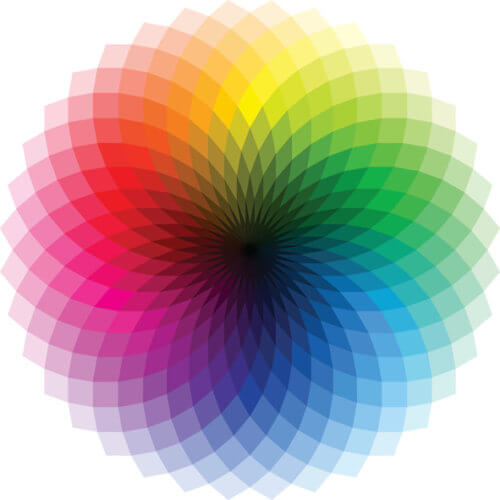
Four Common Color Schemes
There are four common color schemes that serve as the basis of most color palettes.
Monochrome
A monochrome color scheme is based solely on one base color and includes different shades and hues of that same color.
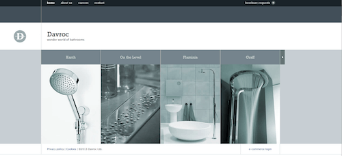
Ex: Davroc
Complementary
A complementary color scheme uses two colors from opposite sides of the color wheel (complementary colors!). It can use various shades of these colors, but they must be within the original complementary colors.

Ex: Slickplan
Analogous
Analogous color schemes use three colors that sit directly next to each other on the color wheel, creating a cohesive look throughout the site but without looking too monotonous.

Ex: Insurance Jack
Triadic
Triadic color schemes also use three colors, but these sit triangular from one another on the color wheel. To create this scheme, pick a base color, then draw an equilateral triangle across the wheel to get the other two colors.
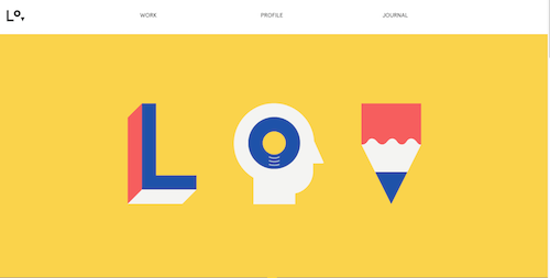
Ex: Lorenzo Verzini
Creating Your Web Design Color Palette
Now that you know the importance of color and how color palettes are made, it’s time to create your own web design color palette. Here are three steps to get you going.
1: Choose a Base Color
No matter which color scheme you choose for your web design color palette, you’ll need to start with a base color. This could be a color you’re already using (ex: for your logo), or a color that evokes an emotion you want to be associated with your brand (ex: green, for growth).
Don’t worry about shade at first. First, pick a basic color as a starting point. Once you have it, you can use a tool like Paletton to find the perfect shade of your main color, which will be your true base color.
2: Choose a Color Scheme
Now that you have your base color, it’s time to choose the color scheme for your palette. While we touched on the traditional four above (monochromatic, complementary, analogous, and triadic), there are plenty of other color schemes out there for you to play with.
The key is to not get overwhelmed with options (or to use too many colors). Instead, focus on how you want your site to be perceived. Do you want to evoke a feeling of serenity? An analogous color scheme could be best, since using colors next to each other on the color wheel creates a sense of harmony.
If you’re stuck, you can also use Paletton to get an idea of how various color schemes will work with your base color and to choose the exact shades that work within your chosen color scheme, which will make up your color palette.
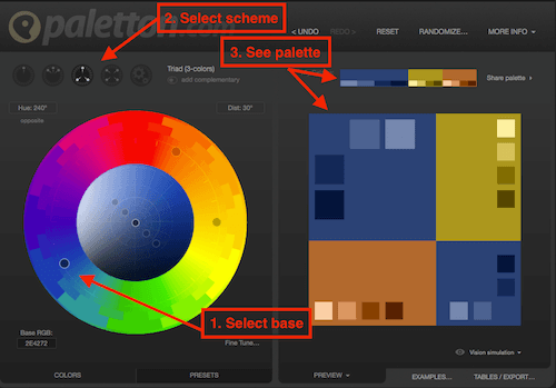
3. Implement Your Color Palette
After choosing your color scheme and using it to build your color palette, you’re ready to unleash it on your site!
Keep in mind that your color palette isn’t just for your background and text. You’ll want to think about the other design elements on your site and how they tie into your color palette, like your photography. As we saw in our website example earlier, photography can make or break your color scheme. Be sure that images you choose fit in with your overall color palette. If you want to start with an image and build your color palette from that, check out this palette generator by Canva.
Alternative: Use an Automated Solution
Alternative – for an automated branding tool, check out Tailor Brands. I used to manually create all my color palettes, but for many side projects, I’ve started handing it off to their AI branding tool.
Next Steps
Again, don’t get paralyzed by choices here. Remember that nothing is set in stone on your site. You may find that once you start using your palette, the hues aren’t quite right.
Don’t sweat it — you can always use one of the tools to tweak your palette until you get the style you’re looking for. The most important thing is to just get started!
Related Posts
- How to Build a Minimally Viable Website
- 404 Page Best Practices, Ideas, & Examples
- Contact Us Page Best Practices, Ideas & Examples
- Ecommerce Product Page Best Practices, Ideas, & Examples
- Effective About Us Page Design: Best Practices & Examples
- FAQ Page Best Practices, Ideas & Examples
- Homepage Best Practices, Ideas, & Examples
- How To Design a Website Layout w/ Best Practices & Examples
- Thank You Page Best Practices, Ideas & Examples
- Website Design Best Practices w/ Examples
- How Much Is A Website Per Year Explained
- 59+ Ways To Find Free Images For Commercial Use
- How to Improve Your Website Content
- How To Write A Meta Description For SEO
- How To Write A Title Tag For SEO
- Landing Page Best Practices w/ Ideas & Examples


