If there’s one page that’s responsible for the biggest impact on a business, it’s the product page for eCommerce shops.
As an eCommerce store, you’re only as powerful as your product pages. These pages can actually make or break a sale and can be the difference between your store thriving online and tanking.
With that said… what makes a good product page?
Here are eight best practices to use on your product pages to ensure they’re getting the job done.
Your Product Page Should…
Showcase your products with high-quality images/videos
When customers shop online, they don’t have the luxury of being able to touch and hold your products — which means high-quality product images are an absolute must on your product page.
But it’s not just the quality of the image… even the image size can affect your sales.
While exact specifications for your images will depend on what your products are and how your site is designed, here are some general product photo guidelines you can follow to make sure your images get the job done:
- Make sure image resolution is at least 72 dpi for optimal clarity
- Feature multiple angles of your products (i.e. back, front, sides, etc.)
- Include image zoom to highlight details on your product
- Keep the image lighting, saturation, and background consistent across product shots
Aside from high-quality images, video can also be an incredible tool in your product page toolbox. In a study by Stacksandstacks.com, visitors who watched a video on a product page were 144% more likely to add a product to their cart.
With that said, video isn’t a must-have for every eCommerce business. For example, if you’re selling men’s ties, a video isn’t crucial to see how the tie looks on a model. Instead, you’d want to rely on a nice zoom feature to highlight the details of your ties.
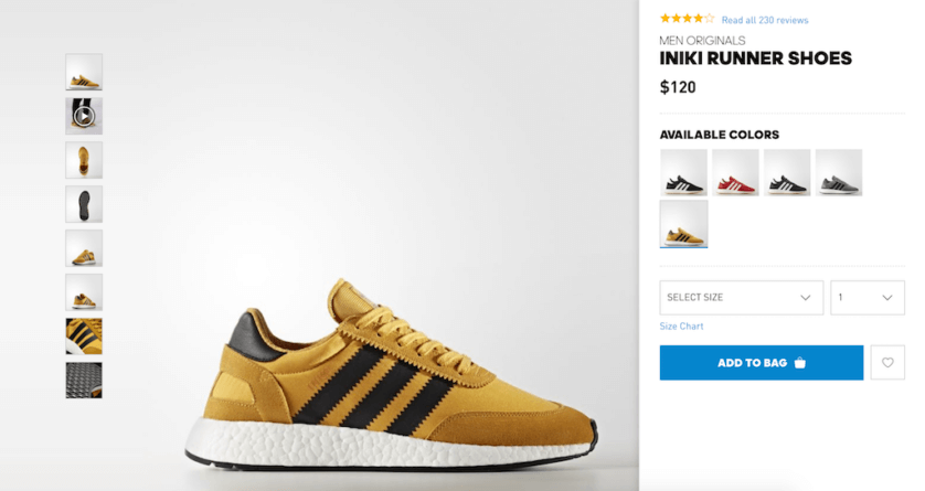
Who does it well: Adidas
Have unique, interesting product descriptions
While product images are crucial to your product page design, product descriptions are equally important. A well-written, informative product description can make a sale.
While it’s tempting to cut and paste your product descriptions across similar products, this creates an awful user experience (not to mention opportunities for organic traffic). Product descriptions are a chance to provide critical information to visitors about your value proposition. What makes this product different? What problem are you solving with your product?
Your product descriptions should hit on the unique value proposition of each product in a clear and concise way. The copy should be informative but to the point, explaining the exact product benefits and features without relying on industry jargon to communicate your message.
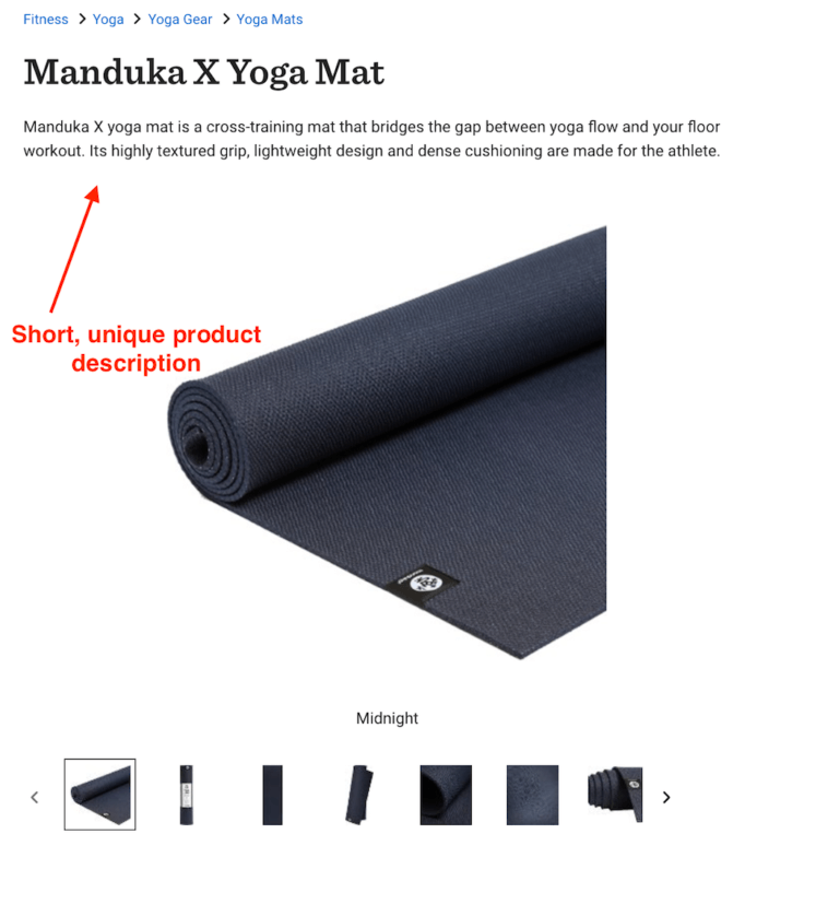
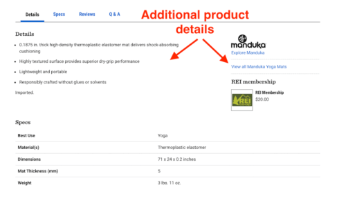
Who does it well: REI
Tell visitors what to do next
There should be no doubt what your customers should do on your product page. This means the page needs a clear path to purchase, starting with a prominent call to action.
Your CTA doesn’t need anything fancy — a simple “add to cart” button can suffice. It should, however, be easy to find and use.
Give your CTA a prominent location on your product page, and use contrast to make it clear against other design elements on your page like the background and imagery.
Last but not least, make sure it’s working before you go live! You can also add a confirmation, such as “[product] has been added to your cart!”, to let customers know they’ve successfully completed the action they want to take.
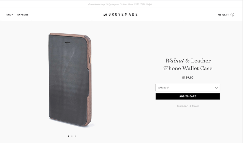
Who does it well: Grovemade
Feature customer reviews
Say you’re looking for a new car. You find two that have all of the features you’re looking for, but there’s one main difference. One has tons of reviews — some positive, some negative — and the other has NO reviews.
Would you buy the one that has no feedback from customers? Probably not.
Customer reviews are essential for establishing trust with potential buyers — especially online. In a survey conducted by eMarketer, 80.7% of respondents stated product reviews were either very important or somewhat important to their decision of whether or not to purchase the product.
This best practice goes both ways — not only do you want to feature reviews on your product page, but you should also offer an easy way for your customers to leave reviews for your products.
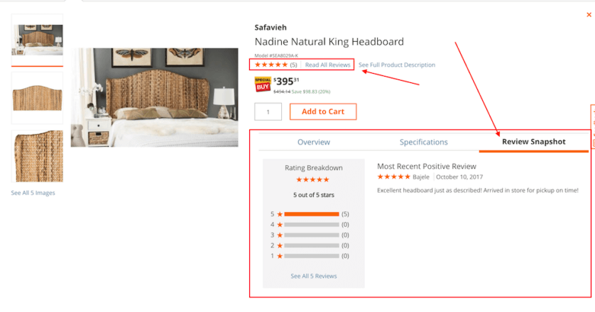
Who does it well: The Home Depot
Include trust badges
Online shopping can be nerve-wracking especially if you’re not familiar with a brand. Online fraud is a serious issue, which means as an eCommerce business, the onus is on you to establish trust and credibility with your customers.
Displaying trust badges (a seal that verifies a site is legitimate) is an easy way to boost confidence with your visitors that you’re a real business and are taking precautionary measures to keep their information safe. Trust badge companies collect data about a business, verify its identity and legitimacy and grant it a badge to confirm its trustworthiness.
There are numerous badge types that can help convey you’re a trustworthy business, from security shields to buyer protection shields. To learn more about which trust badges would be right for your business and how to get one, see here.

Who does it well: Bourbon & Boots
Be transparent about shipping and returns
Have you ever found the perfect product online, only to find out on the last step of checkout that you have to pay an arm and a leg for shipping? If you’re like most online shoppers, you probably abandoned ship.
In fact, unexpected shipping costs were the leading cause of site abandonment according to this 2016 study by VWO.
Shoppers want complete transparency throughout their entire online shopping experience — which means no hidden shipping costs!
If you’re charging customers for shipping, be sure to display your policy clearly on your product page so your customers know before they even add their product to their cart that they’ll need to account for shipping charges when buying.
This policy applies to returns, too. If a customer isn’t 100% sold on your product, they’re going to want to know exactly how long they have to try it out before it needs to be back in your hands. Is it 14 days? A whole month? Are returns free? Spell it out on your product pages so visitors don’t have to go hunting for the information.
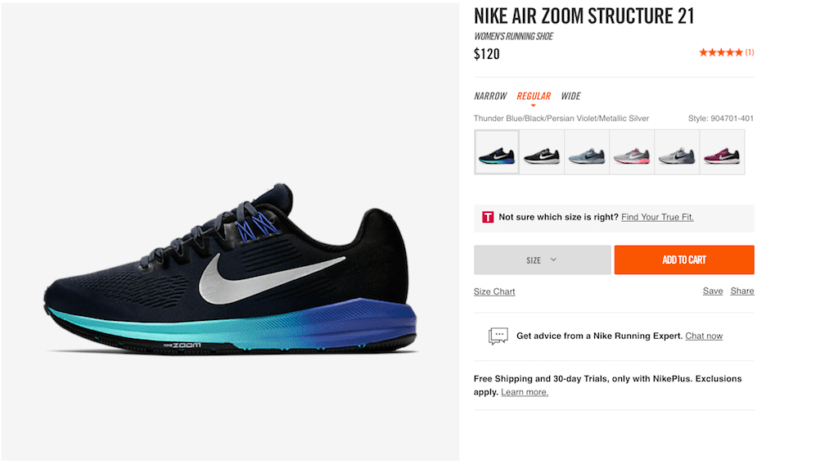
Who does it well: Nike
Prioritize page speed
Page load time is a huge factor in site abandonment. You can have a terrific design with beautiful images, great product descriptions, and killer reviews… but if the page takes forever to load, it won’t matter a bit.
Consumers have grown to expect almost instantaneous page load on websites. According to Kissmetrics, 79% of online shoppers who have trouble with a site’s performance won’t return to shop there again, and half of web users expect pages to load in two seconds or less.
Your page speed can be affected by several things, such as a complex website design, your server response time, large images and files, large pages, etc.
To check your page speed and identify opportunities for optimization, use Google’s PageSpeed Insights tool.
Be optimized for mobile/tablet
By 2020, mobile eCommerce is forecasted to make up 45% of the US eCommerce market. Shoppers are spending more and more time on their mobile devices, which means your website needs to be optimized for mobile experiences.
A great mobile eCommerce page features product images that are easy to see and explore, quick page load, and a seamless mobile checkout experience.
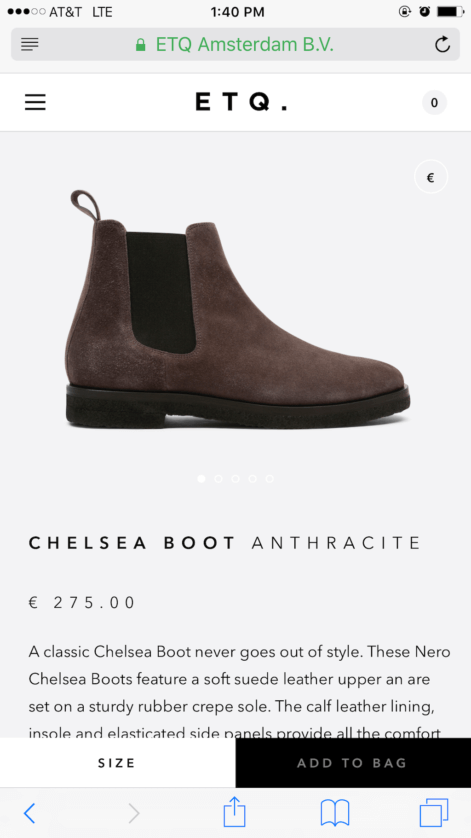
Who does it well: ETQ
Getting the Most out of your product page:
Now that you’ve got the best practices down for your product page, it’s time to dive a bit deeper. A stand-out product page can make a huge difference in your site’s conversion rate if done correctly. Here’s a grab bag of tips and tricks to make sure you’re getting the most out of your product pages.
Use the scarcity principle
Creating a sense of urgency can be a great way to improve conversions on your site. By using the scarcity principle on your product pages, you create a sense of urgency for your site visitors and eliminate time they may spend mulling over whether or not to purchase. If something is selling out quickly, customers may be more likely to hop on it before time runs out.
Keep in mind that your product page has to follow general best practices to work. Leaving a message like “only 3 left!” on a product page that is poorly designed, slow to load, and doesn’t feature great product images isn’t going to help your conversions.
Amazon uses the scarcity principle frequently, especially when they’re offering deals on select products.
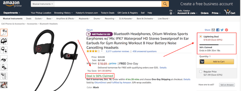
Leverage your FAQ to help remove doubt
With so many options online, it’s up to you to provide all of the information your customers need to understand the value of your products and what makes you better than your competition.
One of the easiest ways to do this on a product page is to leverage information from your FAQ page to answer common questions about your products and remove any remaining doubt. This strategy allows you to be transparent and detailed with your product information without completely overwhelming your product page with paragraphs of information.
If there are common questions across all products, you can pull information from your FAQ page and feature it below the fold on your product page. You can also link directly to your FAQ page from your product page to give clear direction on where users can go for answers to common questions.
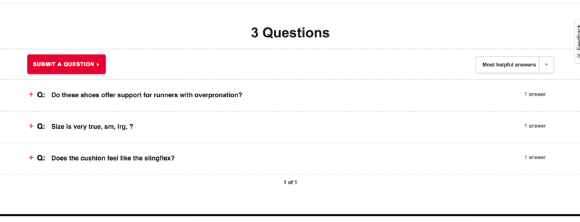
Under Armour takes a unique approach to this by offering a “Questions” area at the bottom of their product pages that highlight product-specific questions and answers, and also allow shoppers to submit questions.
Show price comparisons
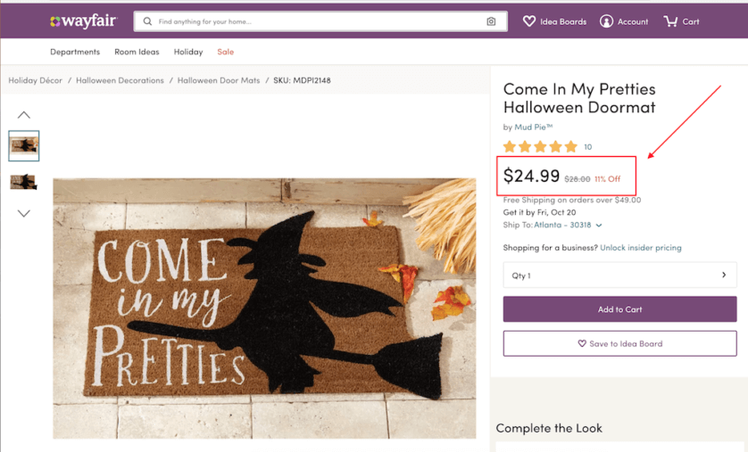
If you’re offering discounts, sales, or lower-than-list prices, show it off directly on your product page. Not only does this show online shoppers your value proposition — it also ensures that your visitors don’t have to leave your site to compare prices.
Wayfair is a great example of an eCommerce site that does this well. Not only do they show a discounted price… they show customers exactly how much they’re saving with the reduced amount to fully show the value save.
Personalize Product Recommendations
Cross-selling products with related product recommendations can be a great way to increase overall cart value, but using personalized product recommendations can be a game-changer.
Personalized product recommendations use actual user behavior to recommend products that are frequently viewed, clicked on, and purchased together. You’ve most likely seen this on Amazon, which has been awing customers for years with their highly personalized product recommendations.
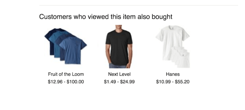
Instead of recommending standard products across the board (that may be unrelated to what your customer is really searching for), personalized product recommendations make your shop feel like it’s created just for the user because it shows products they’re likely to be interested in.
Conclusion & Next Steps
Your product pages are arguably the most important pages on your eCommerce website. Everything from your images to your descriptions can make a serious impact on a shopper’s decision to purchase or abandon ship.
In order to create superior product pages, focus first on the fundamentals. Make sure you have high-quality images that feature multiple angels of your products and a zoomed-in look at them as well. Also, spend some time crafting thoughtful descriptions. Remember that users don’t have the opportunity to physically touch and feel your products or see them at scale, so rely on your descriptions to provide a full picture of your products.
Lastly, remember that transparency is key. Shoppers want to know everything upfront — shipping, returns, prices, discounts, etc. Make sure to give them all of the information in a digestible and easily discoverable format.
Read more about building an eCommerce strategy here and choosing the right eCommerce platform here.
Related Articles
- How to Build a Minimally Viable Website
- 404 Page Best Practices, Ideas, & Examples
- Contact Us Page Best Practices, Ideas & Examples
- Website Design Best Practices w/ Examples
- Effective About Us Page Design: Best Practices & Examples
- FAQ Page Best Practices, Ideas & Examples
- Homepage Best Practices, Ideas, & Examples
- How To Design a Website Layout w/ Best Practices & Examples
- Thank You Page Best Practices, Ideas & Examples
- What Is A Web Design Color Palette and How Do I Make One?
- How Much Is A Website Per Year Explained
- 59+ Ways To Find Free Images For Commercial Use
- How to Improve Your Website Content
- How To Write A Meta Description For SEO
- How To Write A Title Tag For SEO
- Landing Page Best Practices w/ Ideas & Examples


