When it comes to having an online portfolio of work — whether for designs, papers, case studies, or your work history — a well-designed portfolio goes a long way in leaving a lasting impression.
But what does a good portfolio look like?
I’ve gathered 9+ useful online portfolio examples for students, teachers, and professionals to serve as inspiration for your portfolio website. But before we go too far, let’s talk best practices:
Portfolio Page Best Practices
So what makes a good portfolio website? While the opportunities for displaying your work are endless, there are a few best practices to keep in mind when designing your portfolio. Here are some key elements of a great online portfolio:
- Clarity over Creativity: It’s easy to get caught up in showcasing your creativity in your portfolio. Adding some extra flair to stand out is fine… until you start sacrificing clarity. Your portfolio website’s main goal should be to clearly show who you are, what you do, and what you’ve done.
- Easy Navigation: Your portfolio should be easy to navigate. Prioritize key pages in your navigation like Work, About, and Contact.
- A Strong Bio: An online portfolio doesn’t just show visitors what you’ve done… it also tells them who you are. A strong About Me page is a great way to share your bio and give visitors a glimpse into what you’re all about.
- Current Work: Your portfolio should feature your most recent work samples. When choosing how to set up your portfolio template, make sure you choose a format you can easily update when you complete a project you’d like to feature.
- Next Steps: What action do you want people to take once they review your portfolio? Should they contact you? Follow you on social media? Do you want a potential client to request a quote? Do you want a hiring manager or potential employers to download your resume? Make it clear what a visitor should do next with a strong call to action.
- Showcase Abilities: Your portfolio is the perfect place to practice what you preach and showcase your abilities. For example, if you’re a graphic designer, use your graphic design portfolio website to show your style. If you are a UX designer, make sure your UX portfolio shows your actual UX design skills.
Online Portfolio Examples
Now that you’ve got the basics down, it’s time to start creating. Here are 9+ beautiful portfolio examples to use for design inspiration.
Katrelle, Music Artist

A great portfolio is not limited to visual arts – it should be an open and representative sample of your creative work. Katrelle’s site has elements of a typical “band” website but formats the work as a video portfolio site with galleries, clips, downloads, bio, and consistent branding.
Website built with – Tailor Brands (Read Tailor Brands Review)
Min Zhou, Product Designer
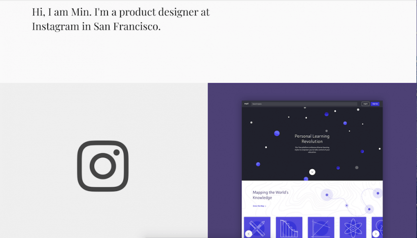
A great portfolio doesn’t have to be elaborate. In fact, sometimes a simple, straightforward approach works best. Min Zhou’s portfolio is a great example of this.
Notice how the navigation is ultra-simple. It features two options: Work and About. Min then leads with a straightforward headline that instantly tells you who he is and what he does. Below that, he showcases his work in a clear grid format that allows you to dive deeper by clicking on each square.
Website built with – Squarespace Website Builder (Squarespace Review)
Sean Halpin, Web Designer
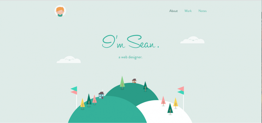
A portfolio is a great place to show your abilities in action, especially in web-based industries like design and development. This web design portfolio by Sean Halpin is a great example of showing your skills and style within the portfolio itself.
Sean’s portfolio website gives off an immediate impression of his website design style, while also showcasing his depth and design process in his work section.
Website built with – minimally built & self-hosted on a VPS hosting account
Pascal van Gemert, Web Developer
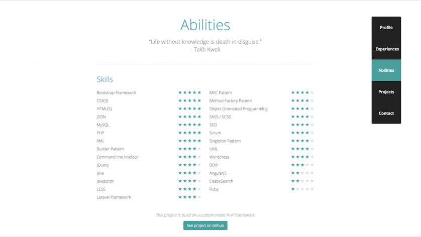
Similar to Sean, this interactive portfolio by Pascal van Gemert is another example of integrating your work into your website. Pascal uses his development skills to create an interactive site that uses unique ways to communicate information, like this star system that shows his experience in certain areas.
Website built with – minimally built & self-hosted on a VPS hosting account
Emma Kay, Creative Director + Stylist
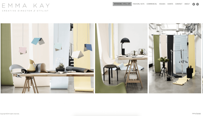
What makes this portfolio unique is the use of segmentation. If you have work across multiple industries, as Emma Kay does, segmenting your portfolio by industry can be a great way to help visitors find the most relevant projects.
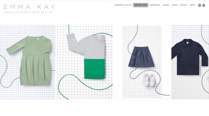
Emma also uses a swipe scroll to help visitors easily browse her work. The design is sleek and provides a great user experience, which is the hallmark of a great website.
Website built with – Format CMS on a shared web host
Brett Bergeron, Designer, Developer, and Creative Director

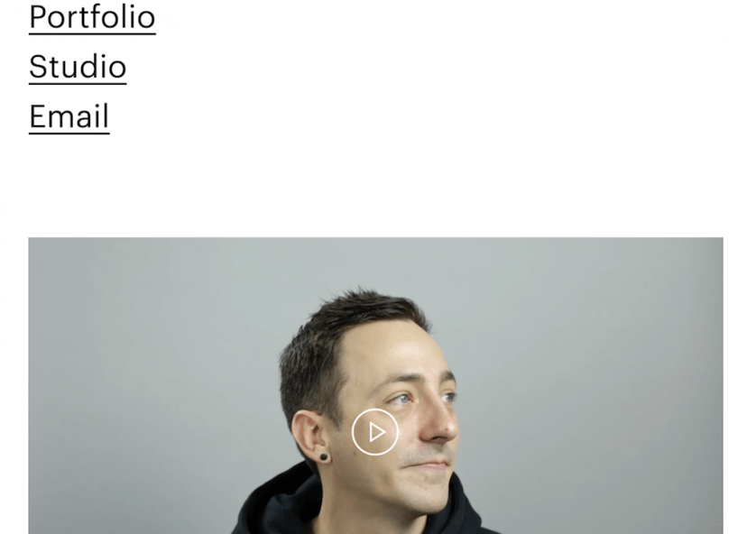
Portfolios don’t always have to be about the visuals. This portfolio by Brett Bergeron uses large text on the homepage to tell you exactly who he is, what he does, and who he works with. It takes up the entire “above the fold” portion of the homepage (jargon for the entire screen before scrolling). If you want to learn more about him, you can scroll down to the navigation and the video, which adds a great balance to the text-heavy homepage.
Website built with – minimally built & web hosting account
Charlie Waite, Designer
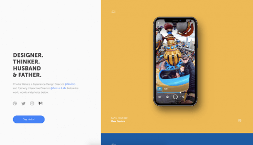
Charlie’s portfolio stands out for two primary reasons. First is the color scheme. The use of complementary colors makes his portfolio pop — your eye is immediately drawn to the yellow and then directly down to the blue section below it, which features another project.
The second is his call to action. Instead of using something generic, like “Contact”, Charlie goes with a much warmer “Say Hello!”, which matches the overall warm vibe of his portfolio page.
Keep in mind that a strong CTA doesn’t mean a boring CTA — it just has to be clear!
Website built with – minimally built & a shared hosting account
Robert Brown Interior Design

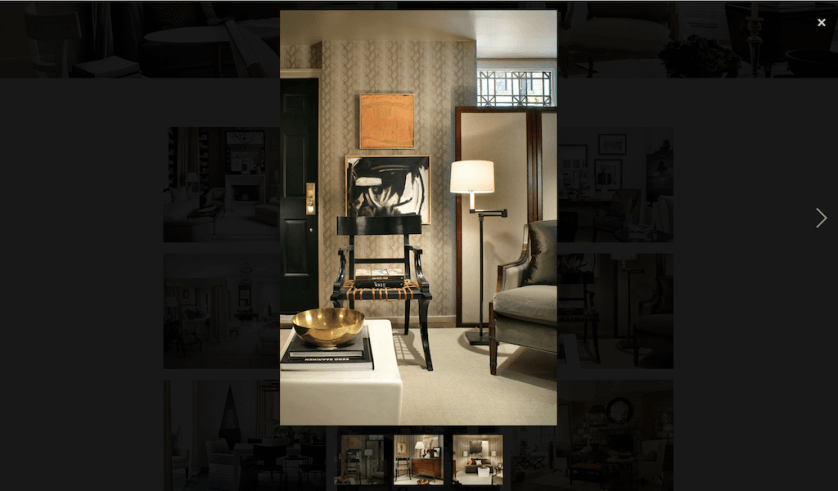
Sometimes less is more, which is exactly what makes this portfolio stand out. As an interior designer, displaying multiple, large-scale projects with several photos can quickly turn a portfolio into photography overload. Robert Brown Interior Design’s approach is much more manageable. The simple grid layout showcases individual projects and creates a cohesive style on the portfolio page. If a visitor wants to see more photos related to a specific project, they can just click on the main photo to open the gallery.
Website built with – minimally built & web hosting account
Sparkle Tafao, Makeup Artist + Hair Stylist
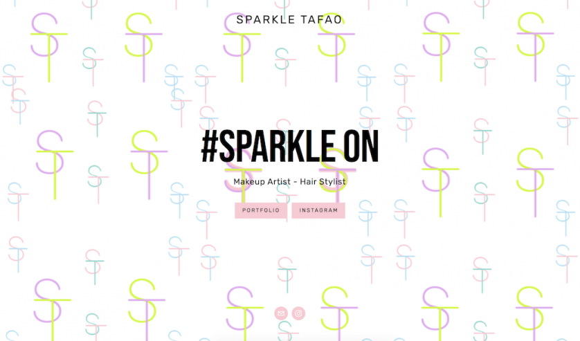
For some industries, like beauty and photography, a portfolio website might not be the primary place to showcase work. Instead, you may rely more on a social channel like Instagram. However, that doesn’t mean you should ignore your website (you still need to have a web presence that you own!). This portfolio by Sparkle Tafao is a great example of how to leverage your website to direct visitors to another channel. When you land on Sparkle’s homepage, you have two options: you can visit her portfolio, or you can check her out on Instagram.
Website built with – Squarespace Website Builder (Squarespace Review)
Kathryne Bevilacqua, Professor
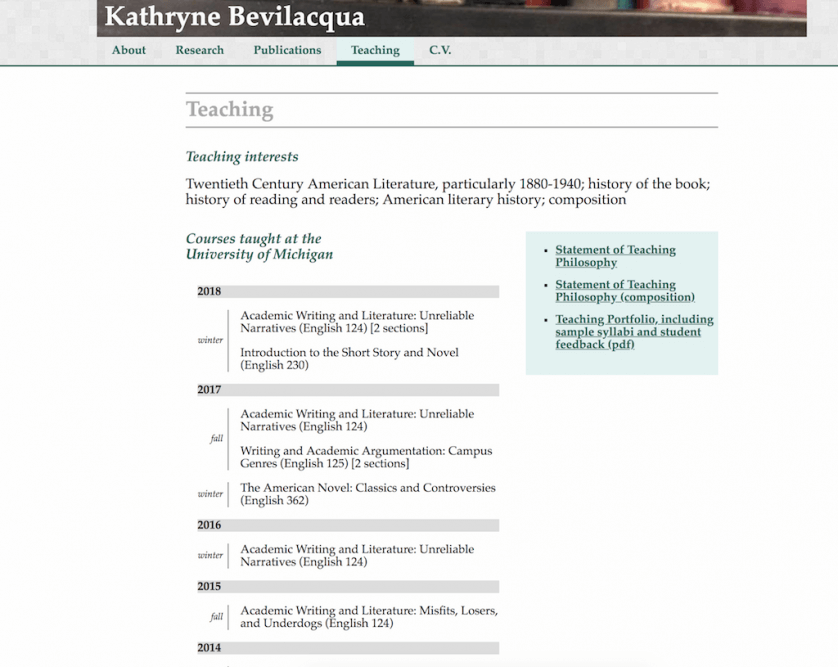
This professor’s portfolio is another example of balancing creativity with clarity. Kathryne Bevilacqua uses an interactive menu to jump you down her website and adds a fun design component with her teaching timeline. However, the information is still easy to consume and find. The portfolio also includes a downloadable PDF for visitors who want to learn more about her teaching.
Remember, your portfolio is a starting point for people to learn about you and your work. You don’t have to include everything on one page. Use it as an entry point and invite visitors deeper.
Website built with – IONOS Hosting
Next Steps
No matter your line of work or purpose – having an accessible portfolio online is essential.
As far as how to get your portfolio online though, there are plenty of options. I created a guide to the best website builders here, although the most common options that I recommend are –
- WordPress.com – a user-friendly option with good functionality, customer service, bundled hosting – and the option to migrate to a self-hosted website in the future. See their Portfolios functionality.
- Self-hosted WordPress – allows for maximum ownership and versatility, but has a bit of a learning curve. Learn how to set up WordPress.
- Wix – a drag and drop website builder with a straight-forward setup and a free plan option. See Wix.


