At face value, the huge variety of pages on the internet might seem to have little in common. But have you ever noticed that the best pages all have a similar feel, even if they’re focused on different topics?
That’s because of a general set of website design best practices: The stylistic decisions that web designers use to make their pages useful and appealing to the widest range of people.
And the more deeper your understanding of these design principles, the better your website will be at capturing your reader’s attention — and keeping it.
So today, I’d like to share the 9 website design best practices, collected from pro web designers and simplified into real world examples.
At its most basic, Your Website Should…
Be Easy and Intuitive to Navigate
First, think about why someone would want to come to your webpage.
Aside from art and design professionals, most people’s first interest will not be in how beautiful the site is (though that can be a bonus). They’re coming to your webpage to help solve a problem: To gather information, to learn something, or to be entertained. And the best way you can give access to all of these things is by making your webpage easy and intuitive to navigate. The web design jargon here is usability and accessibility.
Really, this is the first principle from which all other web design best practices originate, and it encompasses the rest of what’s included in this guide. My main advice: Don’t feel like you need to reinvent the wheel with your website design. Find a few pages that feel right to you and match the type of site you’re building, and copy their general layout. Chances are, if a web design is successful for a big name on the internet, it will work for you, too.
Who Does It Well: The Wirecutter, a wildly successful product review site with a balanced, easy to use web design.
Have A Simple, Consistent Style
The most common mistake I see beginners make when building a website is adding too much. Too many colors, too many typefaces, and too many graphics (even too much white space!) quickly add up to one result for your reader: Confusion.
Let’s take a closer look at each of these elements, and how to do it simply and effectively.
- Colors: Use as few as you need to make navigation clear and intuitive. Three to five colors is the sweet spot for most websites; two is usually too few, and 6+ will start to clash with your images. (Here’s how to make a web design color palette, in case you’re interested.)
- Graphics: Any images or moving graphics you include should have a definite purpose. This includes drop-down menus and chat boxes, which should help direct your reader to the next step — not distract their attention from your main message.
- Typefaces: Save the decorated, flourishing typography for a different project. Simple, highly legible typefaces are the way to go for websites. Arial, Times New Roman, and Helvetica are the big three for the web. Choose one, and don’t use more than about 3 different font sizes on any one page.

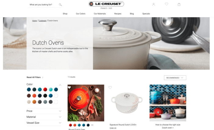
Who Does It Well: Le Creuset, a French cookware brand, keeps their design choices simple and minimal. This lets them highlight their main feature: The beautiful colors of their ceramic-coated cookware.
Focus On Images, Not Just Text
A wall of text might be the quickest way to get a reader to click away from your website. That’s because as far as researchers can tell, the human attention span has been rapidly decreasing — at least for looking at webpages. This is especially true with the rise of mobile browsing; more on that in a moment.
In this case, the old adage is true: A picture really is worth a thousand words. By focusing on a balance between images and text on your website, you can keep your reader’s attention longer, giving you more time to communicate your message.
And what if you don’t have any images of your own to publish on your site? Not a problem — just use one of the many search engines for free images for commercial use to find the pictures that suit you best.

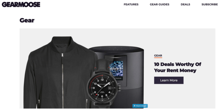
Who Does It Well: GearMoose, a men’s lifestyle website, features images prominently on their homepage. This leads readers to browse longer, choose something that catches their eye, and then read a text-focused review on the next page.
Have A Purpose For Each Page
From the simplest three-page personal website to the most sprawling ecommerce mega sites, the best websites make sure every page has a distinct purpose. So when you’re designing each page of your website, it helps to ask a few basic questions:
- What is the “big idea” for this page?
- What do you want to communicate?
- Who do you want to read this page? And what should they get from it?
- What do you want the reader to do after they look at your page?
But please, don’t overthink it. Oftentimes, the answers to each of these questions will be quite simple. As an example, let’s look at a “contact us” page for a business:
- What is the “big idea” for this page? You need a way for people to get in touch with you after visiting your website.
- What do you want to communicate? You are available for quick, convenient contact.
- Who do you want to read this page? And what should they get from it? Potential clients or customers, who should understand how to get in touch with you.
- What do you want the reader to do after they look at your page? Contact you, and start communicating about how you can help each other.
Go through that same process with your homepage, about us page, and FAQ page, and you’ll have the basics of a minimally viable website mapped out and ready to go. Then, if you decide to go the ecommerce route, you’ll have a solid base to build your product pages, thank you pages, and 404 pages, too.

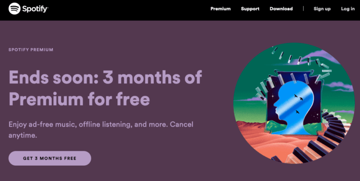
Who Does It Well: Spotify‘s website is clear and straight to the point, with five major pages at the top that will cover 90% of readers’ needs.
Be Friendly To Mobile Users
Year by year, the boom in smart phones has meant a shift from desktop-based browsing to mobile. In fact, according to Perficient, 68.1% of all website visits in 2020 came from mobile devices — meaning that your website needs to look just as good on a mobile screen as it does on a desktop computer.
In the tech world, the ability for a webpage to seamlessly transition from desktop to mobile to tablet viewing is an example of responsive design. That means a website’s structure is highly flexible, rather than locked into a single way of viewing it.
Luckily for most beginner web designers and hobbyists, the major content management systems — like WordPress, the system that we use for ShivarWeb — handle responsive design for you. The WordPress theme will automatically adjust the layout and placement of text and images to accommodate desktop and mobile browsers readers alike.
Even so, I always recommend that anyone making a webpage check it out on desktop, mobile, and tablet. Better yet, try using a few different web browsers; not everyone will be on Chrome or Firefox, and you want to make sure that the most readers get the best experience possible.

Who Does It Well: NPR, the National Public Radio, displays flawlessly on both desktop and mobile without sacrificing their clean, unique aesthetic.
Show Your Most Important Things First
When a visitor clicks through to your web page, what’s the first thing you want them to see? If you’re following website design best practices, it’ll be whatever is most important. Because in the first few seconds that a reader scans your homepage, you’ll want to catch their attention and direct it towards the purpose of that page.
In the design world, this principle is also known as “visual hierarchy.” And you’ll see it in used all the time in the real world, too:
- On menus at restaurants, where the names and descriptions of the foods feature much more prominently than their price.
- On street signs and billboards, where the main message will be the boldest and most noticeable part of it.
- In department stores, where their most popular items (or sale items) are placed near the front entrance so you have to walk by them.
What’s the most important thing for each page of your website? That will relate back to the purpose of the page, as discussed above. Whenever you decide what the primary goal of your page is, put extra effort into making sure it stands out front and center as soon as the page loads.
Who Does It Well: Netflix, if you don’t already have an account, draws your attention immediately towards getting signed up for their service.
Stick To A Proven Layout
AKA conventionality, design standards
The early days of the internet have set the precedent for what most readers expect, even out of today’s websites. Think of this like the architecture of a building: If a door isn’t in the place where you’d normally find one, you’ll be disoriented and confused (and very well may not enter the building at all).
A few of these precedents or conventions include:
- The main navigation menu should be at the top of the page with a drop down menu item list
- The logo will be at the top left (or sometimes center) of the page
- Clicking the logo will take you back to the home page
- Links / buttons that you’ve previously clicked on will change colors
- A shopping cart icon in the upper right of any ecommerce pages
When you’re building your website / blog, look at as many similar sites as possible to get a feel for the conventions, aesthetics, and functionality unique to your niche. For more advice, check out our in-depth guide to website layout best practices, too.
Who Does It Well: The Associated Press News website is about as conventional as it comes.
Load Quickly
Remember how we were talking about the short attention spans of readers on the web? Well, that doesn’t just apply to when your page is already loaded. So for every second that your website takes to load, that’s a second of your reader’s attention span that’s already been used up. Needless to say, making your pages load quickly will always be an advantage.
A lot of the speed of your website’s first load is tied to your choice of hosting provider. And that’s a bigger topic than I can cover in this small section, so I’d recommend you check out our hub page for web hosting provider reviews. There, you’ll get the full run-down on pros and cons for each hosting provider, including their relative speed and cost of keeping your website running.
Aside from that, sticking to the guidelines we’ve already been working on — simplicity, consistency, and conventionality — will keep your site running fast and smooth.
Who Does It Well: Even with explosive graphics on every page, Adobe consistently loads quickly, and it’s easy to navigate as well.
Pay Attention to SEO
Perhaps the easiest way to improve your website content is to pay closer attention to search engine optimization, or SEO. And while the study of SEO can turn into a full time job, even a few quick tricks will make your website more visible for Google — and in turn, more easily accessible to readers.
First, learn how to write meta descriptions for SEO. They’re kind of like the blurb on a book’s back cover: Not the flashiest piece of information, but definitely a deciding factor in whether you’ll buy the book (or click on your website, in this case).
Then, make sure you know how to write a title tag for SEO, too. The title tag is the number one element on your page that search engines use to understand what’s on your site. And when they bookmark your page to revisit later, the custom title tag you’ve made will be the title they see in their favorites folder.
After that, deciding on keywords and mapping out a content strategy will be your next step. And while that’s a bit beyond the scope of this article, we do have an awful lot of links about SEO to get you off on the right foot.
Who Does It Well: Ahrefs is an all-in-one SEO tool, and their website is a darned fine example of how to use the advice they give.
Next Steps
Building a “good-looking” website might sound challenging, but it’s really an exercise in paying attention to details. Start actively paying attention to elements that you like as a user – not fancy design elements, but things that make your visit so easy that you don’t even think about it.
Be sure to explore our other resources on hiring a web designer, or finding a good logo maker, among other design posts.
Related Articles
- How to Build a Minimally Viable Website
- 404 Page Best Practices, Ideas, & Examples
- Contact Us Page Best Practices, Ideas & Examples
- Ecommerce Product Page Best Practices, Ideas, & Examples
- Effective About Us Page Design: Best Practices & Examples
- FAQ Page Best Practices, Ideas & Examples
- Homepage Best Practices, Ideas, & Examples
- How To Design a Website Layout w/ Best Practices & Examples
- Thank You Page Best Practices, Ideas & Examples
- What Is A Web Design Color Palette and How Do I Make One?
- How Much Is A Website Per Year Explained
- 59+ Ways To Find Free Images For Commercial Use
- How to Improve Your Website Content
- How To Write A Meta Description For SEO
- How To Write A Title Tag For SEO
- Landing Page Best Practices w/ Ideas & Examples


