So you’re considering using Wix as your website builder, and you’re looking for Wix website examples for inspiration and confirmation that you’re making the right choice.
Wix is one of the biggest names in the website builder product space. They not only have a drag-and-drop site builder, which means users can “drag” different elements around and “drop” them where they want, but they also have a large Wix template selection based on industry, along with their Wix ADI tool which automatically builds a design from scratch.
The Wix editor makes nice designs incredibly accessible for DIY-ers while leaving the heavy-lifting (AKA hosting, functionality, coding) to someone else. It is also available on the Wix app for on the go editing.
But before we dive into examples of what a Wix site look like in the wild, there is one thing to keep in mind when you’re evaluating a website platform: it’s not just about how the websites look. The functionality matters too.
Think of it like buying a car. You have a make / model in mind, and you’re probably looking to see them drive by on the road to see how they actually look. However, you also care about how they operate. Does it accelerate well? Does it have the hauling capabilities you need? How is the gas mileage?
Looking at a website platform should be done in the same way. We collected the following Wix examples not just to show you how they look, but how a Wix powered website can function so you can be sure you have a website that fits both the style you want and the functionality you need.
General Wix Website Examples
Let’s start with a general round up of solid Wix website examples. We’ve pulled these examples based on functionality, web design, and usability. Again, Wix works incredibly well for DIY-ers who want an easy-to-use website that they can throw up on their own without having to worry about the inner-workings. However, be aware that with this comes trade-offs (i.e. you give up some control, functionality, customization, etc.)
Bentop Events

Bentop Events’ website is a great example of how visual Wix’s templates can be. For businesses that rely on portfolios, the card layout is an easy way to organize and showcase your best work without making the page overwhelming. The website also allows visitors to “learn more” by clicking on a button over the image, which takes you to a full landing page on that specific project. If you need a straightforward visual portfolio with basic click-through functionality, use this example for inspiration.
Integra

While the visual design of this site is rather simple, it’s part of what it so effective. Not all websites need to be a design masterpiece. Instead, this site focuses on what matters: copy that describes what the company is all about, and a video that showcases the service in action. If you’re looking for a basic website where you can throw up some text and basic images/video, this template should serve as a good example of what’s possible.
Tube Relevant
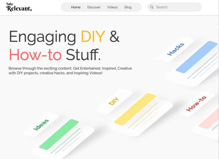
Tube Relevant’s site is a good example of a content-heavy site built with Wix. It utilizes Wix’s site search functionality prominently along with hero images for major content categories.
Wix Wedding Website Examples
Wedding websites are a great way to give guests information about the big day, show off your personality, and post updates / pictures / anything else you may want to share with those who are involved with your wedding. Given this website has a shorter lifespan than say, a business website, you’ll want something that’s easy to customize, edit, and manage. Here’s a great example of what you can do with a Wix wedding website:
Mary and Bill
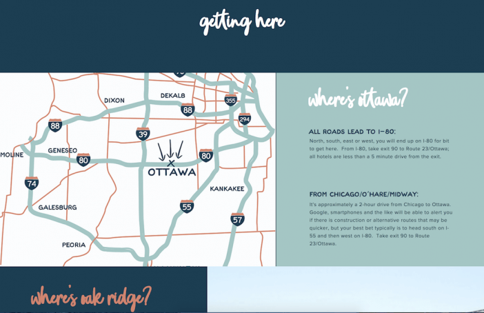
Mary and Bill’s wedding website is a great example of how a simple theme can be transformed into a fun, personalized website without having to custom-build something complex. Their “getting there” page has a cool graphic design for the map image, directions, and fun fonts and colors — all elements that make their website unique to them without having to spend money on a custom designed website that you’ll only update for a year or two.
Wix Photography Website Examples
Photography websites are all about the portfolio of work. When looking for a Wix website example to serve as inspiration for your photography, pay special attention to the layout options for your work. You want to be sure you’re showing off your photos in a creative way without sacrificing the user experience (AKA fast photo load speed, easy navigation, high quality images, etc). Many sites also use the Wix Bookings plugin that allows clients to reserve slots directly on a photographers’ site. Here are a few examples of photography websites we liked:
Louiza Photographe
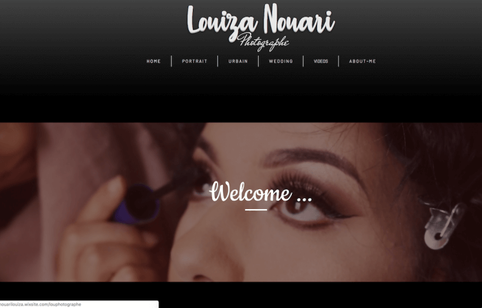
When you implement video into your photography services, showcasing that work for your site visitors is crucial. That’s exactly what sets Louiza Nouari’s website apart from others. The homepage features a B-Roll style video, while each individual service page showcases work in the traditional portfolio style. It’s clean while still being multidimensional by incorporating different mediums.
Drew Sturge

What makes this Wix website a great example for photographers is the layout of the portfolio page. The use of a carousel of photos at the top of the portfolio page and grid style underneath give the website a unique interactive feel without overloading the functionality or making it too difficult for visitors to navigate. Drew’s given visitors an easy way to view his work in a way that’s sleek, visually coherent across the board, and is easy-to-use — all hallmarks of a great website.
Wix eCommerce Website Example
Ecommerce websites are all about their products. A good eCommerce website should have high-quality product images, be easy to navigate, and keep the focus on what you have to offer your shoppers! You’ll also want to include strong product descriptions and an easy check out process. Here are a few of our favorite Wix ecommerce website examples:
Wild North Kids
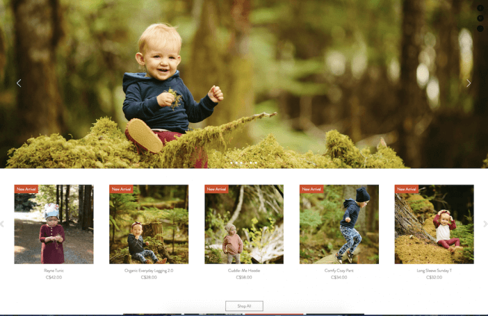
A great online store comes down to a few main things: high quality product photos, easy navigation menu, and easy check out. This Wix store from Wild Kids North checks all of those boxes. What stood out to us especially was how straightforward the homepage is. The header image is a carousel that showcases the products, and new arrivals are listed immediately below. The collection page itself is also straightforward and clean:
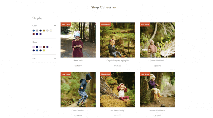
The site appears to use a plugin or extension from the Wix App Market. A visitor can sort by color and size, and each product is easy to see and click through too for adding to cart and checking out.
The Jomu Co
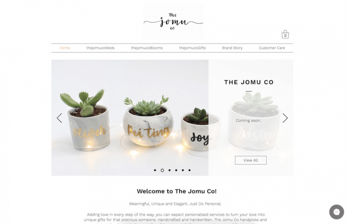
The Jomu Co’s website stands out for a few reasons. First is the carousel at the top of the homepage. The use of the carousel to feature different products / categories is a great way to give visitors a quick look at what’s available on the site and dive deeper into those products.
Next is the blurb underneath the carousel and breakdown of product categories.
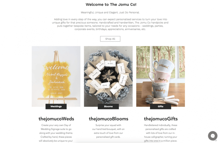
The Jomu Co does a great job of introducing what its shop is all about, which is crucial for first time shoppers who may not know what you’re actually offering. After introducing the brand, they feature a breakdown of their product categories, giving shoppers several different ways to navigate all they have to offer. Plus, the chat in the bottom right hand corner of the page adds a layer of customer service that is perfect for eCommerce sites!
Wix Artist Website Examples
Need to showcase your art? An artist website is a great way to create a digital portfolio of your work. These websites should be easy to navigate, keep the focus on your artwork, and have a contact form to allow prospective clients / commissioners to get in touch. Here’s an example of a great artist website on the Wix platform:
Aly Dalrymple
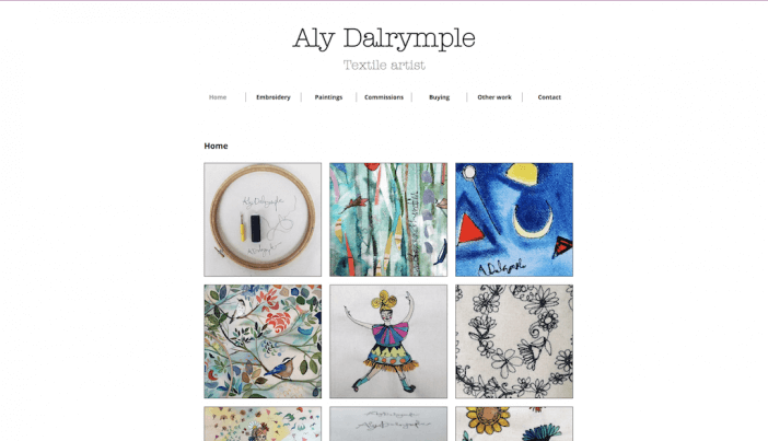
Sometimes, less is more… and that’s exactly what makes Aly’s website so effective. The clean layout draws your eye right to her artwork, and the simple navigation menu at the top of the page makes it easy to find exactly what you need on her website. This is another great example of a Wix portfolio website that is a good fit for a DIY-er who just needs a place to showcase their work in an easily digestible format.
Wix Music Website Examples
Similar to artist websites, music websites are all about the music. Which means if you’re creating a music website, you’ll need a player so visitors can listen to your work on your site. You’ll also want to give people the opportunity to connect with you by listing social media channels, tour dates, and places they can buy your albums! Here’s a strong example of a music website created with Wix:
Dan Bettridge

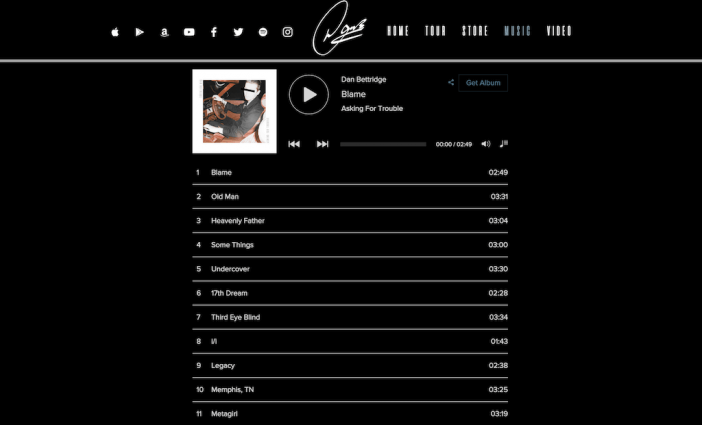
What stands out about Dan’s website is how the structure keeps the focus solely on the music — which, for a music website, is crucial! As soon as you get to the homepage, you have the option to play or buy his newest album. You can also scroll down to check out other updates and videos. The music page also has a great layout. It lists all of the songs on the newest albums, then has smaller modules for older albums below that link out to iTunes.
Wix Business Website Examples
A strong business website showcases your services, have an easy contact form, and builds social proof. Visitors should be able to understand exactly who you are and what you do when they land on their site, and should be able to easily navigate to what they’re looking for from your homepage. Here are a few examples of strong Wix business website examples:
Books Covered

What stands out about Books Covered’s website is that while it uses a typical grid-style layout, the brand colors and imagery make this website look and feel completely unique. It’s a really beautiful website that functions well. This site is a great example of how to take a simple website layout and make it look polished, professional, and creative without having to create something entirely from scratch.
Booth Harrington & Johns

Have you ever been on a business’ website and felt frustrated because you couldn’t figure out how to contact them? This is something that Booth Harrington & Johns’ website does really well. There are multiple places where you can see contact information (i.e. at the top of the page and on the sidebar). It’s also easy to find where you can learn more about their services, which is another crucial component of a business website!
Wix Personal Website Examples
Personal websites are exactly what they sound like… personal! Whether it’s a resume / portfolio website you use to get booked or a blog you use to create content, this type of site is all about getting your personal brand online and owning your space on the Internet. Personal websites should be easy to edit, manage, and customize. Here’s an example of a Wix personal website to use for inspiration:
Meghan Kreidler

It’s easy to get caught up in showcasing your personality and creativity on your personal website. And while adding in some flair is fine, you don’t want to sacrifice clarity in the name of creativity. Meghan’s website includes the right balance of both. The navigation changes the main box content, making it easy to read about who she is, what she does, and what she’s done. If you’re looking for an easy way to put your work and experience out into the world, this layout does the trick.
Next Steps
At the end of the day, choosing your website platform goes far beyond design. Why? Because all web pages are made of HTML & CSS with a few scripts thrown in. This means that any website template can exist on any good web platform.
What YOU want to focus on is the design elements and functionality that are available on the platform you’re choosing.
If you feel like the Wix website builder fits the design and functionality needs you have for your website, you can explore more Wix templates here. They have a free option (supported by a Wix ad), but also have a affordable premium plan options.
Not sure if Wix is the right fit? Check out this guide to website builders (such as WordPress, etc).


