So you’re considering using Weebly as your website builder, and you’re looking for Weebly website examples for inspiration and confirmation that you’re making the right choice. Read my Weebly Review.
Weebly is an all-in-one “hosted website platform.” A hosted website platform is where all the components needed for a website come in a single bundle with a single monthly price.
Weebly provides the software to manage your website content; they provide the designs and functionality. They provide add-ons & extensions for unique functionality. All plans come with a choice of Weebly theme that has customizable templates. You can use the Weebly editor to get the website design that you want. And most importantly, they are your hosting provider (aka the server where your website files live) & security all in one price.
Essentially, using Weebly is like renting an apartment. You can customize the inside, but you don’t have as much freedom as owning a condo or a home.
But before we dive into examples of what Weebly websites look like in the wild, there is one thing to keep in mind when you’re evaluating a website platform: it’s not just about how the websites look. The functionality matters too.
Think of it as buying a car. You have a make / model in mind, and you’re probably looking to see them drive by on the road to see how they actually look. However, you also care about how they operate. Does it accelerate well? Does it have the hauling capabilities you need? What is the gas mileage?
Looking at a website platform should be done in the same way. We collected the following Weebly examples not just to show you how they look, but how Weebly websites can function so you can be sure you have a website that fits both the style you want and the functionality you need.
General Website Examples
Let’s start with a general round-up of solid Weebly website examples. We’ve pulled these examples based on functionality, design, and usability. Again, Weebly works incredibly well for DIY-ers who want an easy-to-use website that they can throw up on their own without having to worry about the inner-workings.
Double Arrow Veterinarians
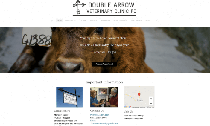
Double Arrow Veterinary Clinic’s website is a great example of using a basic website template to get the job done. Visitors can immediately book an appointment, the navigation menu at the top is clear and concise, and the important information bar puts all of the must-know info front and center. If you’re looking for an easy website that allows you to provide crucial information, this template is a great example.
Pueblo Dental Surgery
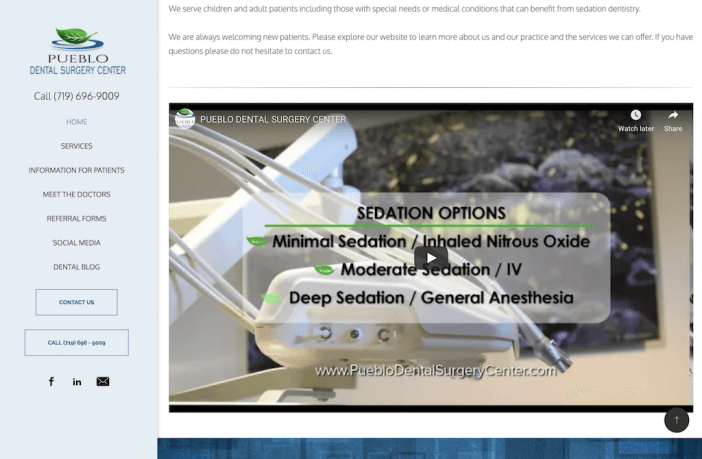
Pueblo Dental Surgery’s website is a great example of a solid, straightforward website. The navigation menu is clear, the homepage includes an introduction with copy that describes what the center is all about, and the video is a great touch for visitors to dive deeper into learning about their services. If you’re looking for a basic website where you can plug in your services + information, this is a good example to use for inspiration.
Wedding Website Example
Wedding websites are a great way to give guests information about the big day, show off your personality, and post updates / pictures / anything else you may want to share with those who are involved with your wedding. Given this website has a shorter lifespan than say, a business website, you’ll want something that’s easy to customize, edit, and manage. Here’s a great example of what you can do with a Weebly wedding website:
Forbes and Don
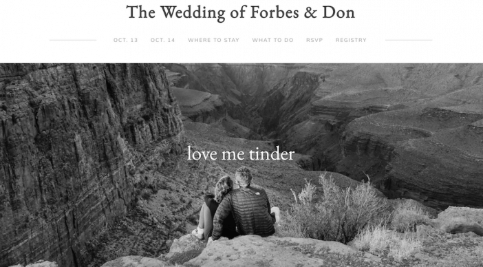
Forbes and Don’s wedding website is a great example of how a simple template can look polished and elegant without having to custom-build something complex. Their fonts, black and white photography, and fun copy (check out how they met!) gives the traditional template added personality. Remember, a wedding website has a relatively short lifespan. What you’re looking for is something you can easily customize and add content to without spending a ton of time (or money!).
Photography Website Example
Photography websites are all about the portfolio of work. When looking for a Weebly website example to serve as inspiration for your photography, pay special attention to the layout options for your work. You want to be sure you’re showing off your photos in a creative way without sacrificing the user experience (AKA fast photo load speed, easy navigation, high quality images, etc). Here are a few examples of photography websites we liked:
Alex Kormann Photography
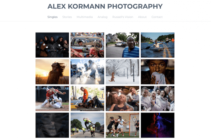
What makes this Weebly website a great example for photographers is the layout. The simple grid pattern centered on the page immediately draws visitors’ eyes to Alex’s work. If you want to explore a piece further, you can hover over the image to get the story, or click to see the larger photo and read the caption. Alex has given visitors an easy way to view his work in a way that’s sleek, visually coherent across the board, and is easy-to-use — all hallmarks of a great website.
Tommy Trenchard

This Weebly website is another example of a great layout for photographers. The use of the carousel of images on the homepage (with the smaller versions underneath) gives the website a unique interactive feel without overloading the functionality or taking the visitors’ attention away from the work itself. If you’re looking for a way to include some interactivity on your site without sacrificing user experience, this is a great way to do it.
eCommerce Website Example
eCommerce websites are all about their products. A good online store should have high-quality product images, be easy to navigate, and keep the focus on what you have to offer your shoppers! You’ll also want to include strong product descriptions and an easy check out process. Here are a few of our favorite Weebly eCommerce website examples:
The Box Bros
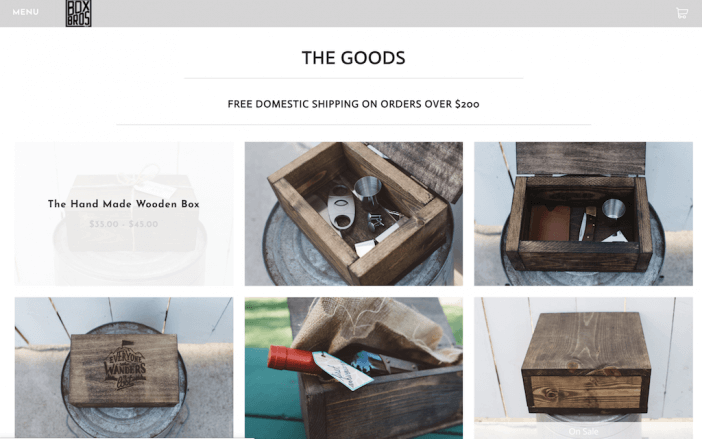
A great eCommerce store comes down to a few main things: high quality product photos, easy navigation, and easy check out. This Weebly store from The Box Bros checks all of those boxes. We particularly liked the product page, where the main focus is on the product images themselves. To get more info, users just have to hover over the image to see the name and price range.
Star Cleaner
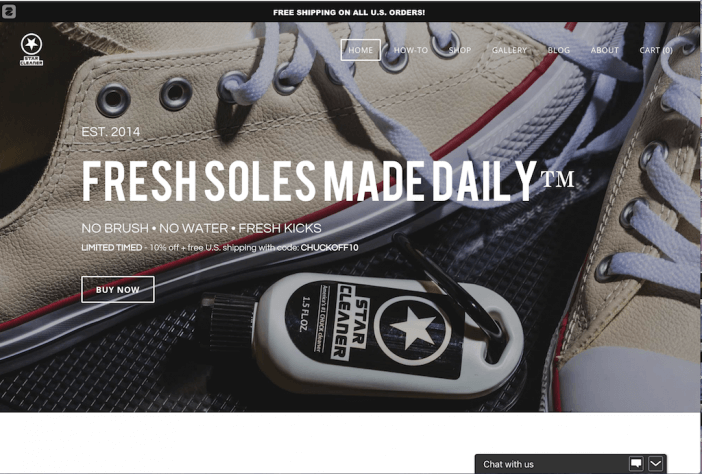
Start Cleaner’s website stands out for a two main reasons. First, the header section includes all of the crucial information you need — the product name, what it does, and a discount code you can use when you “buy now”. The navigation is also clear and concise, and the banner at the top that broadcasts free shipping adds a nice value proposition.
Second, the chat with us bar in the bottom right hand corner of the page adds a layer of customer service that’s perfect for eCommerce sites. It gives shoppers an easy way to ask questions or get in touch if there’s an issue.
Artist Website Example
Need to showcase your art? An artist website is a great way to create a digital portfolio of your work. These websites should be easy to navigate, keep the focus on your artwork, and allow prospective clients / commissioners to contact you easily. Here’s an example of a great artist Weebly website:
Wendy Leach
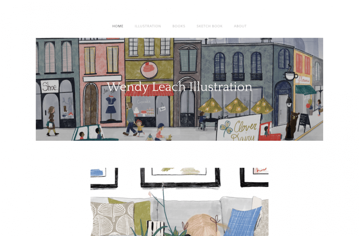
Wendy’s website stood out to us for a few reasons. First, the use of her illustration in the header is a great example of how to implement creativity on your Weebly artist website without having to create something incredibly complex or custom-built. Sometimes, a touch of uniqueness goes a long way.
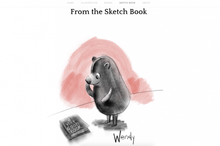
We also enjoyed the sketch book page of her site. It’s a fun to showcase pieces that perhaps don’t fit with her main work, and a great example of how navigation / website structure doesn’t always have to be your usual “about“, “portfolio“, “contact” pages (just remember not to sacrifice clarity for creativity).
Music Website Example
Similar to artist websites, music websites are all about the music. Which means if you’re creating a music website, you’ll need a player so visitors can listen to your work on your Weebly site. You’ll also want to give people the opportunity to connect with you by listing social media channels, tour dates, and places they can buy your albums! Here’s a strong example of a music website created with Weebly:
Boyante

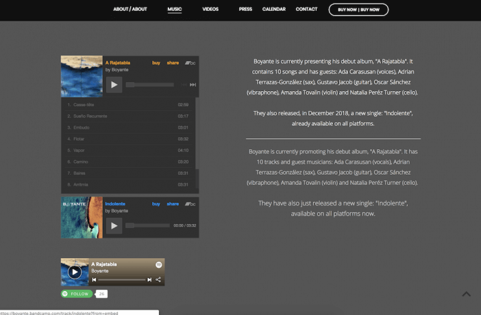
Boyante’s website is a great example of keeping the focus solely on the music. Their navigation gives visitors clear directions on how to learn more about them, hear their songs, and buy their music. The social media icons in the top right corner are also a great touch.
Further down the page, the site includes a music player combined with a simple About section. The combination of the player and the text is a great way for visitors to listen to the songs while also reading about the band, and the Spotify Follow button is a great way to move fans to their Spotify channel, where they can stay connected to their music and new releases.
Business Website Example
A strong business website showcases your services, gives customers the opportunity to contact you, and builds social proof. Visitors should be able to know exactly who you are and what you do when they land on their site and should be able to easily navigate to what they’re looking for from your homepage. Here are a few examples of strong Weebly business website examples:
E.S. Johnson Builders
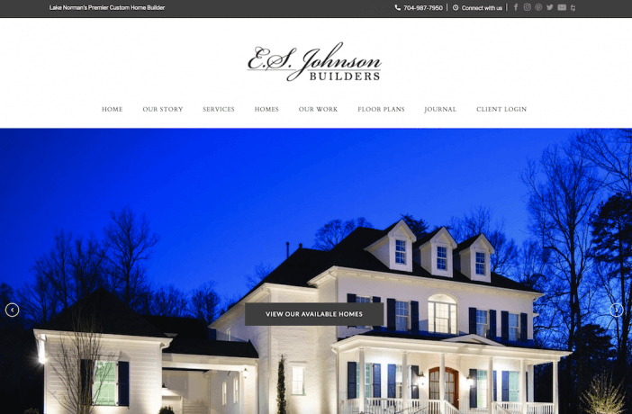
E.S. Johnson Builders is a great example of a sleek and professional business website that checks all of the boxes: it’s easy to navigate, showcases work and services, and has contact information clearly displayed and easily accessible. We particularly liked the slider at the top of the homepage, which gives visitors multiple navigation options, like see available homes and view current projects (both essential for homebuyers who want a custom-build).
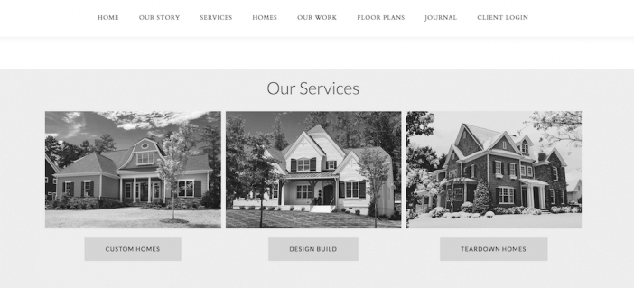
We also found that the Services section further down the homepage, where they feature a breakdown of their services with buttons to dive deeper into each, was a great way to add another layer of navigation to homepage without making it muddled or confusing.
FocusStage
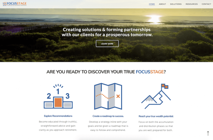
FocusStage is another great example of a sleek business website that hits all the marks for great user experience, clarity of communication on what the business is about and how they can help you, and ease to contact. One of the elements that stood out to us was the video header on the homepage, which adds dimension without complication. We also liked the breakdown of the FocusStage process — it’s a great way to show visitors what it’s like to work with this financial firm.
Personal Website Examples
Personal websites are exactly what they sound like… personal! Whether it’s a resume / portfolio website you use to get booked or a blog you use to create content, this type of site is all about getting your personal brand online and owning your space on the Internet. A personal website should be easy to edit and manage with plenty of customization options. Here’s an example of a Weebly personal website to use for inspiration:
Dave Horak
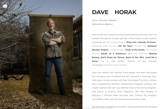
Oftentimes, people get so focused on web design that they tend to forget that what really matters on a personal website is, well, you. Dave’s site is a great example of how you can build your personal brand and showcase your work without a ton of flair (in fact, great copy will do the trick). If you’re looking for a simple layout that gives you the opportunity to tell everyone what you’re all about, this one will do the trick.
Next Steps
At the end of the day, choosing your website platform goes far beyond design. Why? Because all web pages are made of HTML & CSS with a few scripts thrown in. This means that any website template can exist on any good web platform.
What YOU want to focus on are the web design elements and functionality that are available on the platform you’re choosing.
If you feel like Weebly fits the design and functionality needs you have for your unique website, you can explore more Weebly templates.
Not sure if Weebly is a right fit? Explore other Weebly alternatives.


