So you’re considering using GoDaddy as your website builder, and you’re looking for GoDaddy website builder examples for inspiration and confirmation that you’re making the right choice of site builder.
GoDaddy is the big brand in the website services industry. From their Super Bowl ads to TV ads to online advertising, they are by far the most well-known choice for GoDaddy domains, GoDaddy hosting, GoDaddy website builder, online stores, and productivity products for small businesses.
And when it comes to their website builder (known as “Websites + Marketing”), GoDaddy is known for its packaged, one-stop bundle. The biggest pro of GoDaddy is that setup is extremely straightforward (fill-in-the-blank style), which makes it extremely appealing to DIY-ers with limited website building experience.
And while simple is great, there are some major tradeoffs & cons, particularly in terms of functionality.
As we dive into examples of what GoDaddy websites look like in the wild, there is one thing to keep in mind when you’re evaluating a website platform: it’s not just about how the websites look. How they operate matters too. That’s the main consideration for all my website builder reviews & my guide to choosing the best website builder.
Think of it like buying a car. You have a make / model in mind, and you’re probably looking to see them drive by on the road to see how they actually look. However, you also care about how they operate. Does it accelerate well? Does it have the hauling capabilities you need? How is the gas mileage?
Looking at a website platform should be done in the same way. We collected the following GoDaddy Websites + Marketing (their website builder brand name) examples not just to show you how they look, but how GoDaddy websites can function so you can be sure you have a website that fits both the style you want and the functionality you need.
General Website Examples
Let’s start with a general round-up of solid GoDaddy website builder examples. We’ve pulled these examples based on functionality, design, and usability. Again, GoDaddy works well for DIY-ers who want an easy-to-use website that they can throw up on their own without having to worry about the inner-workings. However, be aware that with this comes trade-offs (i.e. you give up control, functionality, customization, etc.).
Citizen Restaurant
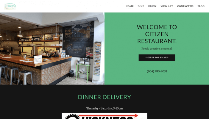
If you’re looking for a straightforward website where you can post content (like menus), this GoDaddy website builder example is a great place to start for inspiration. The homepage is straightforward, with a simple call to action to sign up for the email list. The navigation is also clear, with the Dine and Drink tabs bringing visitors to pages where they can download a PDF version of the dining and drinks menus.
Augusta Blues Company
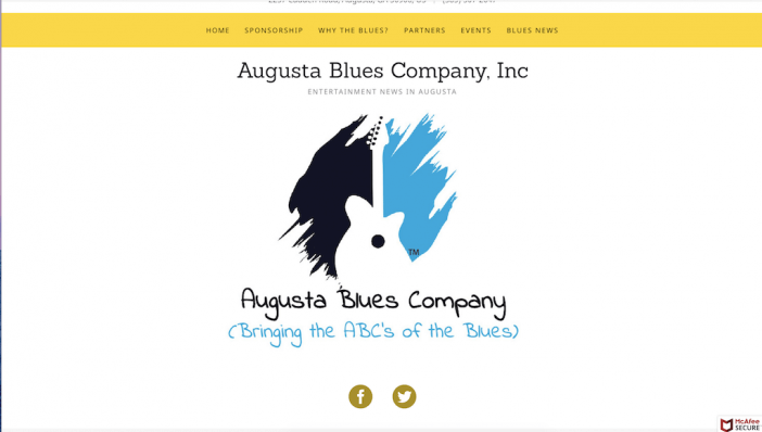
What stands out to us about this GoDaddy website how it makes the most of its simplicity. By using a custom graphic on the homepage for the header image, Augusta Blues Company has added some custom flair to this straightforward template. We also found the navigation to be straightforward and easy to use, which is a key hallmark of a good website!
And for those who need to provide directions on their website, this GoDaddy website builder example showcases how you can integrate a map on the homepage. We particularly liked how August Blues Company paired the map with other contact information.

Wedding Website Example
Wedding websites are a great way to give guests information about the big day, show off your personality, and post updates / pictures / anything else you may want to share with those who are involved with your wedding. Given this website has a shorter lifespan than say, a business website, you’ll want something that’s easy to customize, edit, and manage. Here’s a great example of what you can do with a GoDaddy GoCentral wedding website:
Dave and Nuria
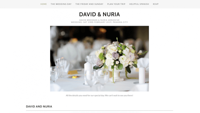
If you’re looking for a simple, polished, easy-to-use wedding website, this example from Dave and Nuria is a great place to start for inspiration. It has all of the necessary information, from the itinerary for the weekend to how to plan your trip, and the RSVP is a simple contact form. It’s a great example of a plug and play website template that saves you time and money, which is especially useful for a site that doesn’t have a long lifespan!
Photography Website Example
Photography websites are all about the portfolio of work. When looking for a GoDaddy website builder example to serve as inspiration for your photography, pay special attention to the layout options for your work. You want to be sure you’re showing off your photos in a creative way without sacrificing the user experience (AKA fast photo load speed, easy to navigate, high quality images, etc). Here are a few examples of GoDaddy photography websites we liked:
Anthony Friend

What makes this GoDaddy website a great example for photographers is the layout of the portfolio page. The grid style makes it easy to get an overview of the photographer’s work without overloading the functionality or making it too difficult for visitors to get an idea of their style.
Richard Eads

Richard’s site provides another photography inspiration example, specifically in how the work is displayed. Notice how this GoDaddy website uses a carousel to feature photos, with a bar underneath that changes as the photos move. It’s a unique way to showcase Richard’s work in a way that’s interactive without being overwhelming.
eCommerce Website Example
Ecommerce websites are all about their products. A good online store should have high-quality product images, be easy to navigate, and keep the focus on what you have to offer your shoppers! You’ll also want to include strong product descriptions and an easy check-out process. Here are a few of our favorite GoDaddy online store examples:
Fashion Saga
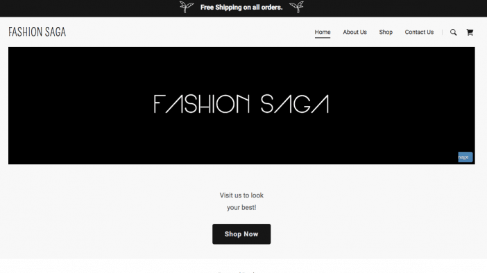
Fashion Saga shows how a minimalist, block-focused look can complement your product’s look. The navigation and products are simple to navigate, and the site has solid focus.
Popcorn Willy
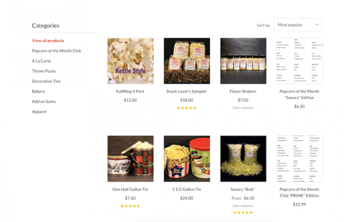
What stood out to us about this GoDaddy online store was the product page organization. The categories help visitors sort through what they’re looking for easily, and the ratings provide another layer of “trust factor” that’s key for eCommerce websites. If you’re looking for a simple way to list products, this website could be a great place to start for inspiration.
Better Living Market
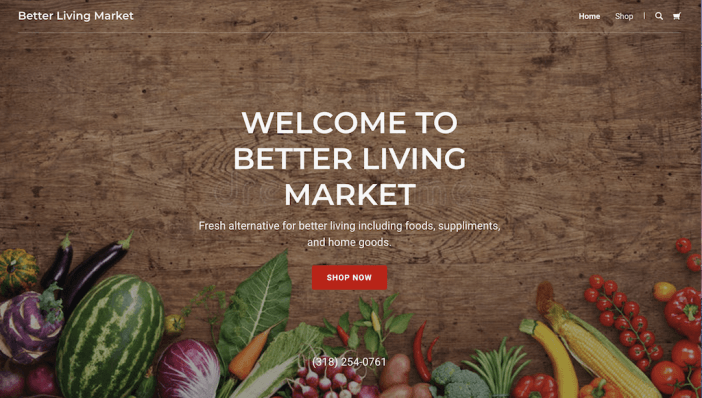
If you’re looking for a bit more “design flair”, check out Better Market Living. This eCommerce website uses a high-quality header image to spruce up the homepage, but still keeps navigation ultra-simple with the shop now button.
Something to note about GoDaddy website builder’s in general: while GoDaddy is known for its simplicity, that does mean limited design customization and functionality. For example, most websites have a similar, block layout. For eCommerce websites specifically, the product pages don’t vary much beyond this layout.
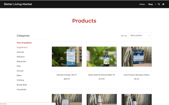
Again, you should choose your website builder not just on design, but on the functionality and levels of customization you need. If you’re looking for a more customized eCommerce shop, there could be better options for you.
Artist Website Example
Need to showcase your art? An artist website is a great way to create a digital portfolio of your work. These websites should be easy to navigate, keep the focus on your artwork, and allow prospective clients / commissioners to contact you easily. Here’s an example of a great artist GoDaddy website:
Jules Art & Design

Sometimes, less is more… and that’s exactly what makes Jules’ website so effective. The clean layout draws your eye right to her artwork, and the simple navigation at the top of the page makes it easy to find exactly what you need on her website. This is another example of a GoDaddy portfolio website that is a good fit for a DIY-er who just needs a place to showcase their work in an easily digestible format.
Music Website Example
Similar to artist websites, music websites are all about the music. Which means if you’re creating a music website, you’ll need a player so visitors can listen to your work on your site. You’ll also want to give people the opportunity to connect with you by listing social media channels, tour dates, and places they can buy your albums! Here’s an example of a music website created with GoDaddy:
Telekinetic Yeti
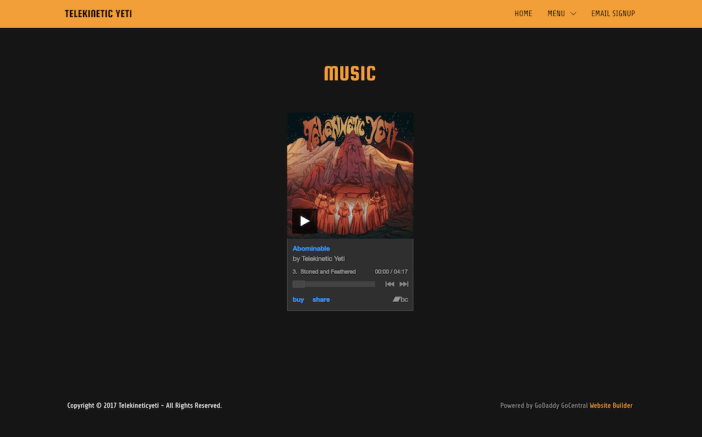
This GoDaddy music website keeps the focus solely on the music. In fact, the music page is a simple, embedded music player where visitors can listen to the band’s most recent album. While it could be more sophisticated, it doesn’t necessarily need to be. Again, it all comes down to your needs. If you wanted some advanced functionality on your music website (like full discography, Spotify integrations, Ticketmaster and Eventbrite integrations, etc.), GoDaddy may not be the best option for you.
Business Website Example
A strong business website showcases your services, gives customers the opportunity to contact you, and builds social proof. Visitors should be able to know exactly who you are and what you do when they land on their site, and should be able to easily navigate to what they’re looking for from your homepage. Here are a few examples of strong GoDaddy Website Builder business website examples:
Fisher King Winery
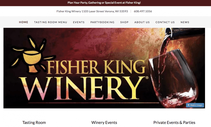
The Fisher King Winery website shows how you can build a fairly large business website on GoDaddy with lots of content and built-in features (such as events, appointments, contact forms, and product sales).
Women Working in Technology

Women Working in Technology has a fairly robust navigation, which goes to show just how much content you can have on your GoDaddy business website. However, the navigation keeps it organized with sub-menus, which means despite the large amount of content on the site, it’s easy to find your way around.
We also liked how Women Working in Technology used a video on their homepage to tell visitors what they’re all about.
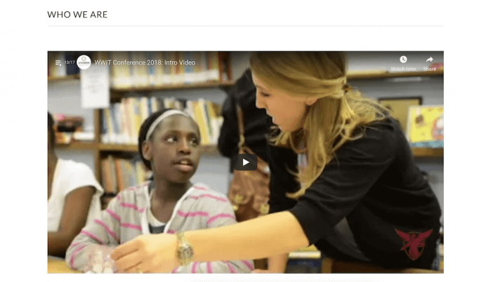
It provides a great way to make the site more interactive without having to build something completely custom!
Crescent Flight Ops

Again, GoDaddy tends to skew towards block-style website templates, and while this business site by Crescent Flight Ops is a bit blocky, their color palette and use of different media types help with the flow. We included this website to show that if you wanted the simplicity, you could still make your theme look different by customizing the colors and actual content on the page.
Personal Website Examples
Personal websites are exactly what they sound like… personal! Whether it’s a resume / portfolio website you use to get booked or a blog you use to create content, this type of site is all about getting your personal brand online and owning your space on the Internet. Personal websites should be easy to edit, manage, and customize. Here’s an example of a GoDaddy personal website to use for inspiration:
Marc Whisnant
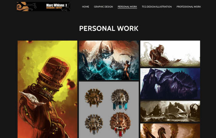
It’s easy to get caught up in showcasing your personality and creativity on your personal website. And while adding in some flair is fine, you don’t want to sacrifice clarity in the name of creativity. Marc’s website includes the right balance of both. We loved how his work stands out in contrast to the black background, but isn’t overwhelming in its grid format.
We also liked how Marc included a downloadable version of his resume on the homepage. This is a great way to share your qualifications with those who may be looking to hire you.
Next Steps
At the end of the day, choosing your website platform goes far beyond design. Why? Because all web pages are made of HTML & CSS with a few scripts thrown in. This means that any website template can exist on any good web platform.
What YOU want to focus on is the design elements and functionality that are available on the platform you’re choosing.
Not sure if GoDaddy is a right fit? Explore other website builder options here.


